#this is based off a really old drawing reference saved to my computer from like freshman year of high school
Explore tagged Tumblr posts
Text
Quick Drawing of Human AU Graffiti Artist Ryan
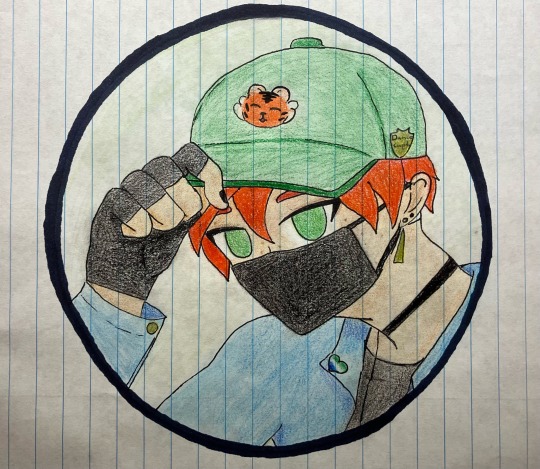
#sing 2#sing ryan#the dancer boy#human au#jean jacket ryan my beloved#the dance captain pin was annoyingly difficult to figure out the design for tbh#art is hard#sorry this is so rough i am currently sick and adding colour will continue to be my nemesis#this is based off a really old drawing reference saved to my computer from like freshman year of high school#so i am sorry i do not remember the original creator of the reference#ive been trying to find it but if someone else is able to#please let me know
5 notes
·
View notes
Text
So to put this in perspective. I was about 5-7 when The Burned Furs was happening. I literally went to see Pokemon: The First Movie IN THEATERS, while this was going on.
By the time I was using the olde internet was about 10 or so. My family had a home computer system with Windows 98 and kept things upgraded over the years due to my dad needing access to "the internet" for work. I was left alone a lot as a kid (busy father/neglectful mother) and this was around the time of "CHECK OUT WWW.POKEMON.COM FOR MORE DETAILS" kind of time of the early internet + advertising. Like I was still using AOL dial-up for a lot of my original internet deep dives. Then, when things like Neopets took off, I was using the computer religiously. I stayed (mostly) on kid-safe spaces, but of course, the internet was, and is, the internet and I eventually branched out. I wanna say I was looking up pictures of Inuyasha to print out and use as art reference, as well as Digimon and Wolf's Rain. I know one of the earliest pieces of furry media was Renamon porn around 2002-2004, as well as a lot of art by Dark Natasha through her website.
At some point around 2005-2006 I stumbled onto VLC. I remember because I saw some furry art by an artist and really liked his style and was emulating it for a bit. At this time, furry art was still ruled by many people emulating Animalympics (which I only knew of because my family owned one of the first official releases of the VHS copies), as well as Osamu Tezuka's deep stylistic influence on the furry community in the 80-90s. The Disney influence from TLK hadn't fully seeped into the community at that point, and, being a little anime kid, I was genuinely fascinated with the art style. One of the first pieces of art I posted online was something I drew inspired by some furry fox art I saw on VLC, but then hyperfixated more into the general "I wanna draw a cool edgy anime wolf" kind of thing.
My first OC, Jade Shadowblood (lol) I made when I was about 9-10. I still own the sketchbook where I first drew her. This was sometime around 2001-2002. She was an Inuyasha self-insert character and intended to be "me" if I was in Inuyasha. I always refereed to her as "this is me if I was a wolf demon" to my friends at the time when I showed them my art in elementary school. I got the idea to make more "wolf demons" of my friends when they asked me if I could draw them as wolves at school. I took a lot of design inspo from Neopets/Neopets Adoptables at the time, and a lot of my original OCs were in fact, based off of kids who were my friends at the time (I have all of these original pieces still saved to this day).
Anyway, I joined DeviantArt in 2006 when I was 12-13 under the handle ShroudofShadows. I heard the name on Xiolin Showdown and thought it sounded cool for an internet username. This was my first real venture into social media. I scanned in and posted some of my old art, and continued making art inspired by Inuyasha, Wolf's Rain, Neopets, etc. It wasn't until about 2007 or so when I shared Jade on DA that one of my friends asked me "is this your fursona?" and I was like "what's a fursona?" and well, here we are I guess?
My first webcomic was started at this time, I found out about other people making wolf comics with their characters and I was like "I wanna do that too". The OG Wolf Song was heavily inspired by Inuyasha/Wolf's Rain, but because I also liked Don Bluth, an inspiration Kay Fedewa also used for her art, I got lumped in as "copying" Kay Fedewa because our styles were similar.
Kay got started with The Blackblood Alliance around the same time I did, and did influence about 5 or so of the original pages. Even though I knew my characters and plot were different and eventually would deviate from looking similar to her art, I just leaned into it since people were accusing me of copying her when we just happened to be posting around the same time. I had no idea who she was prior to people comparing me to her.
Wolf Song, ran for several years, but due to being bullies by TheRoguez/RayJ and her band fo merry fuckwads who made it their goal to "remove" wolf comics off of deviantart (the great sparkledog cleanse) and people like MirrorZan and BlueShineWolf having some very public drama in the wolf comic community, I eventually stopped working on my comic to do a big re-write. I wanted to FINALLY get out from under the "oh you're just copying these people" bullshit because I was like "I literally don't know who this is until you name dropped them". I stayed in my lane with Wolf Song and didn't branch out too much to other wolf comic artists since we were all getting harassed at this point. I didn't really know who to trust outside of the friends I had made in my early DA days.
By 17, I was applying for colleges and didn't have time to work on Wolf Song anymore. This was also around the time the other Wolf Song, the one on youtube, began taking off more and my comic was buried under the popularity. I figured "eh ok" and dropped the project while focusing on school.
I never felt like I really fit in with any one place/group. I had my own space and the fans of my comic which made me happy, so I avoided social media/fandom stuff for a few years. I was always on the fringes of the furry fandom, but due to coming across some really racist proboards forums about the furry fandom when I finally looked into it and saw "N*ggers can't be furry/therian/otherkin", I was like "ok fuck you too" and never wanted to participate in the fandom.
#jackal's journal#Wolf Song is still up in fully btw like#I never deleted anything online#I had no reason to#I had nothing to hide and this was my portfolio for college basically#fucking hell this brought up so many old memories
40 notes
·
View notes
Text
a deadly education is tone-deaf at best and racist at worse; not the cure to jkr anyone was hoping for
Harry Potter’s massive cultural impact means that we haven’t seen the last of magic schools set in Britain, and we probably won’t for a long while. In some ways, the fantasy genre’s response to Rowling’s work is tiresome. In others, it’s exciting—because a generation of readers and writers have grown up to bring their own perspective to the limits of Rowling’s work and push it beyond the limits of its author. However, if you’re looking for a transgressive magic academy book that interrogates the limited morality, inclusivity, and perspective of Harry Potter, you should put Naomi Novik’s A Deadly Education back on the shelf and keep looking.
A Deadly Education tells the story of Galadriel “El” Higgins, a half-British half-Indian sorcerer attending a magic school where the consequences of any mistake might mean sudden death. El is a loner by nature and circumstance, but walking alone in the halls of Scholomance might mean being attacked and devoured by one of the school’s monsters. This puts El on a crash course with Orion Lake, the shining hero of her year who takes it upon himself to save the lives of his fellow students, including a less-than-grateful El.
The set up honestly sounds pretty good—a prickly protagonist, a heroic rival-slash-love interest, a deadly setting, and the potential for deep lore in magic and world-building. Unfortunately, not only does Novik fail to deliver on any of the premises’ strengths, she also chooses to weigh her narrative down with reductive, tone-deaf, and downright racist details.
El’s particular class of magic relies on language. El speaks English and Marathi, and picks up Sanskrit, Hindi, Latin and Old English in her study of language-based spells. It’s a little uncomfortable that Novik lumps dead and defunct languages like Latin and Old English together with actively spoken ones like Mandarin, Hindi, and Spanish, but that isn’t where Novik’s faux paus end. El approaches languages like computer programs to be downloaded onto her hard drive. Despite languages being the basis of her magic, she has no personal connections to the ones she’s speaking. She views other students and their languages the same way, identifying groups of students as “the Mandarin speakers”, “the Arabic speakers,” etc. Novik seems clueless about the relationships between the languages she’s building her world’s magic around, putting Sanskrit tombs in Baghdad and declaring that the Scholomance has a library aisle containing all of India’s languages. (About 800 individual languages are spoken in India, fyi.)
This clinical approach to diversity extends from language into character. El doesn’t try to make many friends, and honestly it’s not hard to see her classmates don’t try to befriend her, either. She doesn’t describe her classmates as people—she describes them as assets. And while that could be explained away by the premise that half her classmates won’t make it out of school alive, and El needs allies more than friends to survive, it doesn’t make it any better when El refers to others exclusively by the language knowledge they offer her. A character named Ibrahim has no personality or backstory, but he conveniently pops up when El needs someone who knows Arabic. A character named Kaito is thoughtlessly grouped in with the Mandarin speakers. An Argentine character exclaims in Spanish when she’s excited or relieved. There’s an uncomfortable distinction between the languages that get written out in the text—Spanish, French—and the ones that get narrated away—a character exclaims in Mandarin.
Novik goes out of her way to let us know that the population of Scholomance is diverse. There’s a group of South and West African students (only one of whom is named, and none of whom are important). There’s a “civilized” enclave of magicians in Toronto who value family and human life more than other groups. One character might graduate and go to Bangkok, but he’s looking to secure himself a place in Shanghai instead. Naomi Novik really knows the names of cities on at least four continents, and she’s not about to let you forget it!
But aside from names, languages, and cities, Novik has given no thought to what diversity means, or who these characters are if they come from diverse backgrounds. El calls on “Mandarin-speaker,” Yi Liu, exclusively by the name Liu. Is Liu meant to be this character’s first name? Or her surname? El doesn’t call anyone else by surname, but Liu is a Chinese surname, one of the most common in the world. El’s father is a Marathi-speaker from Mumbai, but El has no personal connection to Indian culture. Her father’s family prophesied that El would be a destroyer, and other than that rejection El has nothing to say about India or half of her culture. She refers to her Indian relatives in clinical English descriptors (my father’s mother, my great-grandmother, my uncles), even though she is purportedly fluent in Marathi and should know words like Panaji, Aaji and Kaka. El says that her Indian family is from an old Hindu enclave, and yet they have djinn as servants. (Djinn aren’t a typical part of Hindu cosmology, though they are a significant part of Islamic texts.)
Making El biracial seems like an afterthought, not something that affects her character in any way. It just creates some truly unfortunate optics, like when El goes on a three-paragraph description of how unnecessary she finds showers and how dirty she is at any given time. El’s father died making sure her pregnant mother (and therefore, El herself) would live, and yet El barely thinks about him. His name is mentioned once in the entire book. El complains that (presumably white) British people “assume she speaks Hindi” or call her the color of weak tea. But her Indian heritage is a veneer placed on top of a character who is otherwise just a default white protagonist.
All this adds up to a character (and a world), that reads as nothing so much as colonial. El feasts on the languages of others for her own edification, power, and survival, but she doesn’t see her classmates as people, and she doesn’t see language as a living thing related to real cultures. And I’m given to believe that Naomi Novik holds the same views, what with how she throws around the word “mana” as part of her world-building without considering its roots and real-life meaning to Polynesian and Melanesian peoples.
However, nothing makes the cultural tone-deafness of this book more evident than this passage:
Dreadlocks are unfortunately not a great idea thanks to lockleeches, which you can probably imagine, but in case you need help, the adult spindly thing comes quietly down at night and pokes an ovipositor into any big clumps of hair, lays an egg inside, and creeps away. A little while later the leech hatches inside its comfy nest, attaches itself to your scalp almost unnoticeably, and starts very gently sucking up your blood and mana while infiltrating further. If you don’t get it out within a week or two, it usually manages to work its way inside the skull, and you’ve got a window of a few days after that before you stop being able to move. On the bright side, something else usually finishes you off quickly at that point.
El’s pithy commentary about imminent death aside, I have a hard time reading anything but casual and thoughtless racism from this passage. The nefarious and deliberate myth of dreadlocks being unhygienic (and by extension, Black people being endemically dirty) is pervasive to this day. And Naomi Novik decides to include this passage in a book that has no major Black characters, in which dreadlocks never even come up in any meaningful way, just to remind us that in this magic world of hers, dreadlocks are dirty! Monster insects nest in them! The consequences are death! There was no good reason to include this passage, and all it does is draw on inaccurate and racist myths and perpetuate them into a world where anti-Black racism is never contended with. Although, I suppose, why would it? El never has need of any languages from the West or South Africans.
A Deadly Education bills itself as a subversive, even feminist, response to Harry Potter. But just like J. K. Rowling, Naomi Novik is a white author who uses other cultures thoughtlessly to build her own magic world. Other cultures and peoples exist, but only to serve the aims and needs of white (or mostly white-coded) characters. Novik has no empathy, no care and apparently no ability to Google anything about the cultures she wants to draw on. And the result isn’t just insulting—it’s boring. The world-building in this book is as dry and dusty as any history written by 19th century British colonizers.
Using some foreign names and making your protagonist biracial does not shield your work from racism. It does open you up to more pitfalls in depicting other peoples and cultures, if you don’t care to look out for them.
It would be nice to close by saying that despite its flaws, A Deadly Education is an enjoyable book. But it isn’t. It’s just a badly-researched, emotionless story told by rote.
195 notes
·
View notes
Text
pinky and the brain - s1e1: das mouse
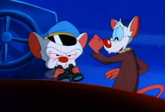
dejavu! have we been here before?
episode summary: brain concocts a hypnotic pancake recipe in order to hypnotise the surrounding population into being his loyal minions. however, one of the crucial ingredients is the meat of a specific type of crab, which can only be found in the reckage of the titanic.
the rundown:
we open with the mice attempting to blow their cage open.
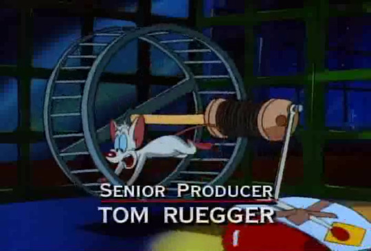
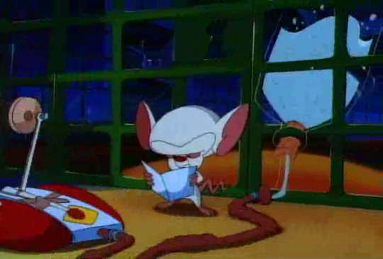
SENIOR PRODUCER: TOM RUEGGER. sorry about that, y’all, but the opening credits are in the actual show, now, so nothing i can really do about it. at least they seem to have a water bottle in their cage, this time, which is good.
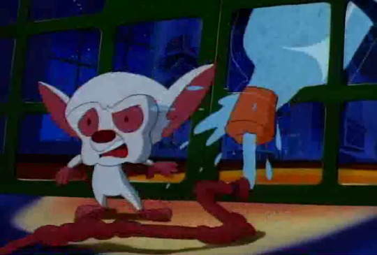
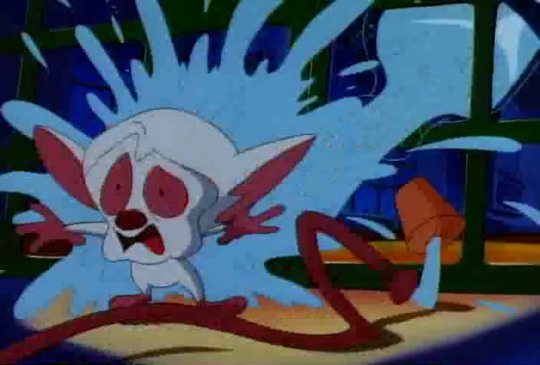
NEVER MIND I GUESS. IT EXPLODED. literally every frame there is a smear frame - again, nothing i can do.
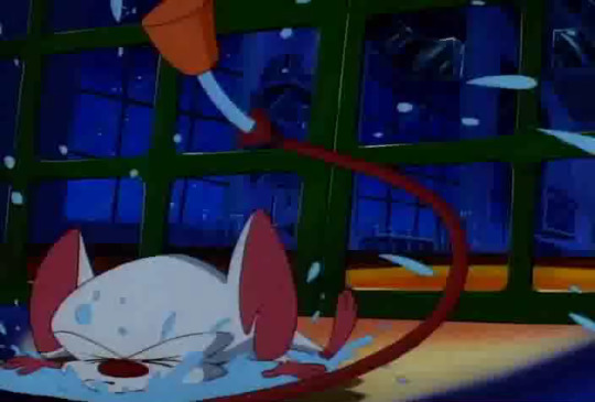
poor mousie go bomp. ):
apparently, the plan was less regarding explosive force, and more to set off a rube goldberg chain of events that completely disobey the laws of physics to end up picking the lock.
PRODUCED BY RUSTY MILLS
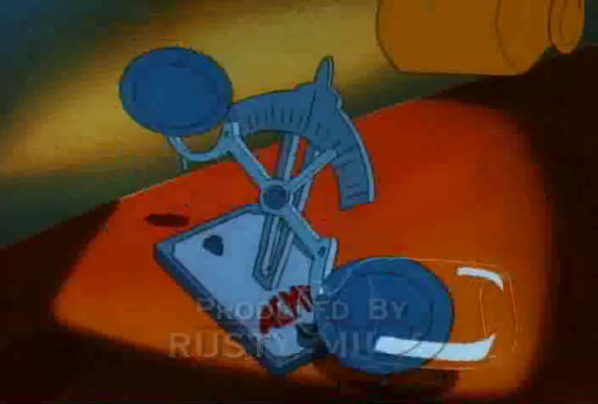
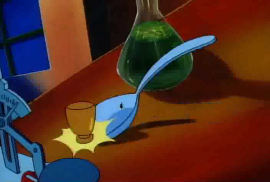
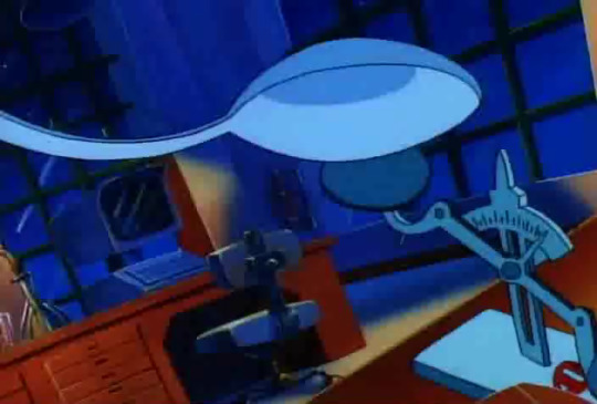
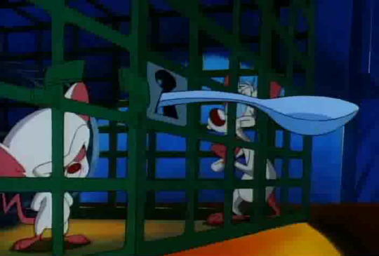
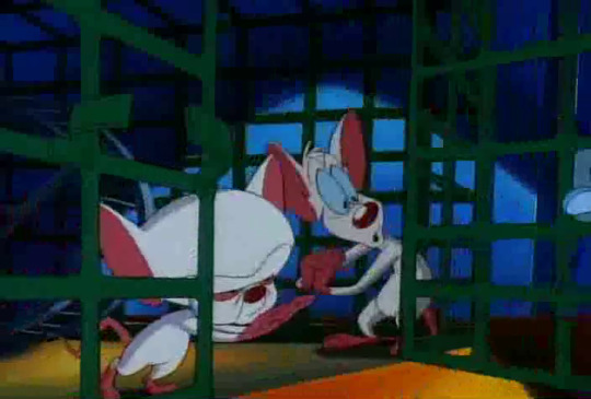
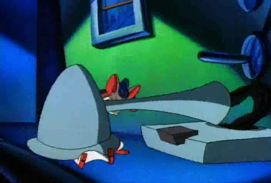
it’s hard to convey without animation, but this spoon flies through the air and just straight up lands in the lock. it’s wild.
“ooo!” says pinky, watching this all impossibly unfold. “good one, brain!”
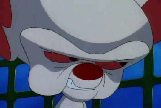
“they’re all good ones, pinky.” we will never be free of brain’s face, it seems.
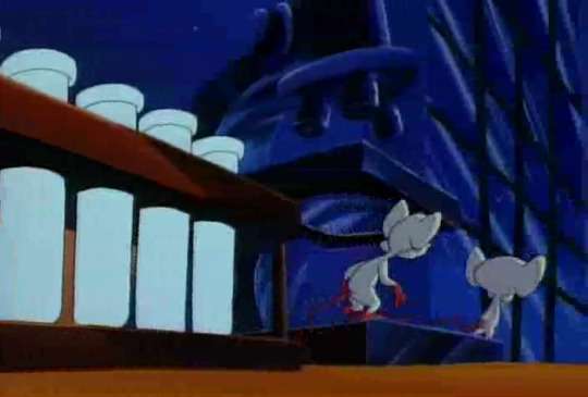
as the mice wander along, brain tells pinky that tonight’s plan will "recieve the aid of legions of unassuming humans”, because he intends to hypnotise them all with the secretions of!
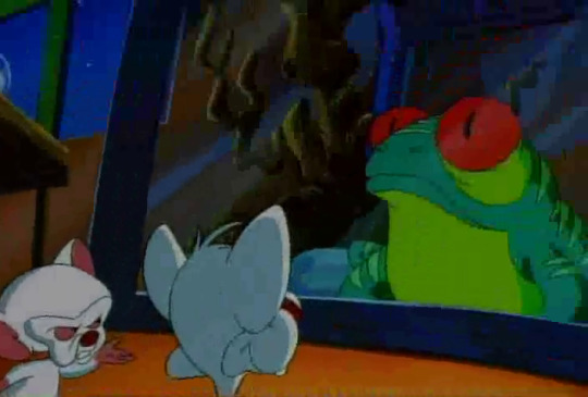
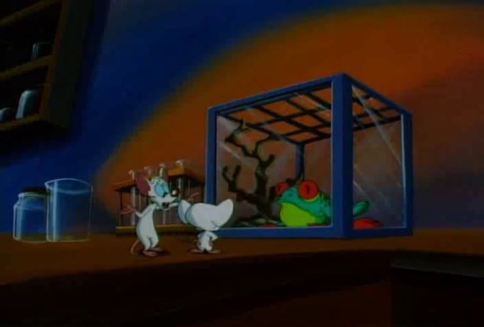
“what, a frog?”
yes, a frog. apparently the frog sweats out hypnotic fluid. it is Filled With Peptides. (pinky’s response to this is “naaaaaarf”, which is very helpful.) after they collect this fluid, brain just needs to work out how to get thousands of people to ingest it.
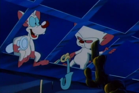
“like a giant pancake jambouree?”
“please, pinky, i--”
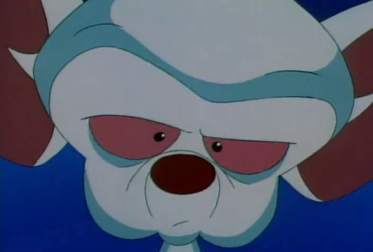

“yes.”
so pancake jambouree it is. brain cooks pinky an experimental batch before he decides to release them to the masses.
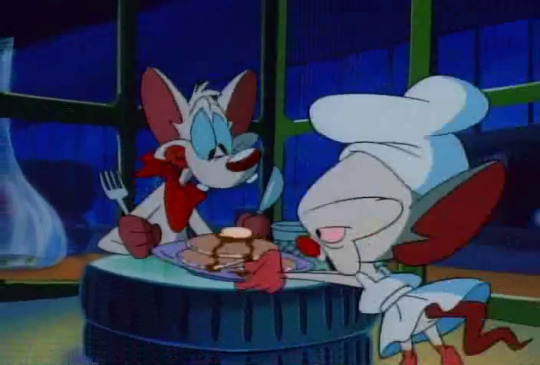
look at brain’s lil dress! and pinky has his tongue stuck out. everyone here is having a good time and it’s very cute. this is exactly what lori alexander wants marriage to be.
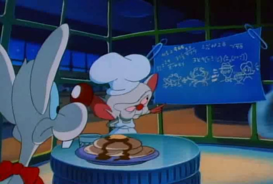
pinky does briefly express his concerns that he might, yknow, be hypnotised, but apparently the concoction doesn’t attain Full Potency until he adds the meat of a fancy crab, and these are just test batches so he can work out how to hide the taste of the Frog Juice.
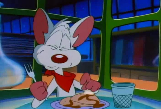


it goes about as well as one would hope.
but never mind, eh? time for crab.
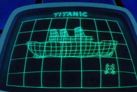
turns out all the crab is stored in the titanic.
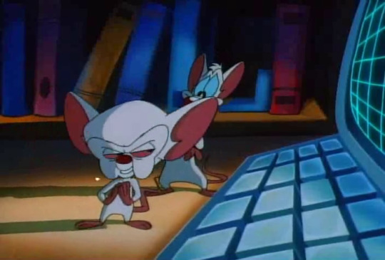
still, brain is pretty convinced that they can just.... go down there and get it. look at his lil scheming face. pinky argues during today’s pondering segment that “there’s still a bug stuck in there from last time” (okay?) and brain cuts him off to insist that they GO DOWN TO THE DEPTHS OF THE OCEAN AND RAISE THE HULL OF THAT SORROWFUL SHIP.
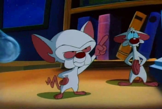
he does a gay little point and everything.
so obviously, they have to steal a boat.
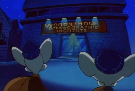
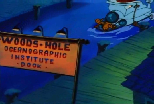
brain got one taste of crime from stealing that minivan, and it just never went away.
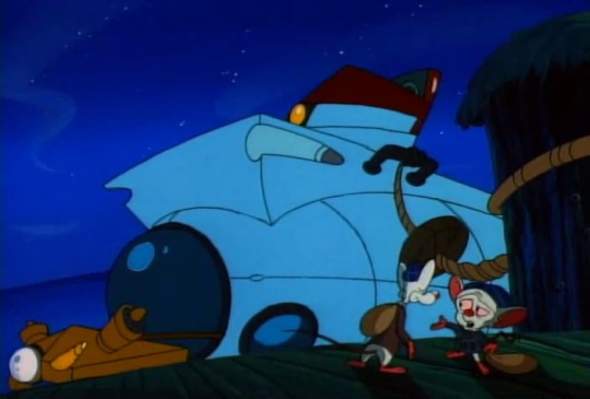
“behold the alvin, pinky. our ticket to the ocean depths.”
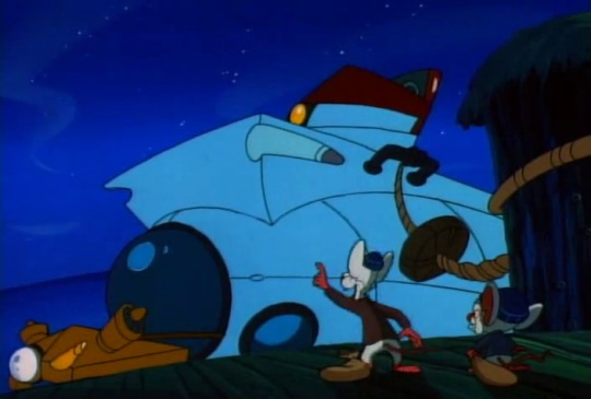
“look, brain! a baby sub on the front!”
“that’s the jason junior, pinky. an additional sub carried by the alvin for remote exploring.”
it’s an additional sub because there’s already one on this mission. (i sweat, watching the fbi draw their guns on me, and insist that i definitely meant submarine. what else could that be, right, guys?)
(the fbi put their guns down.)
anyway the mice steal the boat.
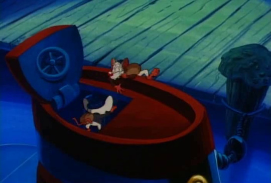
in they go.
the first thing brain does is swap out his hat for one that he brought with him, and demand to be referred to as “captain brain”, so he is definitely someone everyone should take seriously.
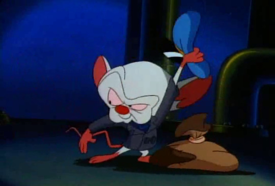
he just packed that specifically.
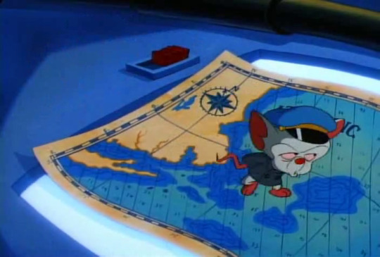
the second thing he does is pull out his big map of the ocean and give pinky a whole bunch of co-ordinates to follow. “bowplans at 2-2-9, on my mark!”
“um, brain?”
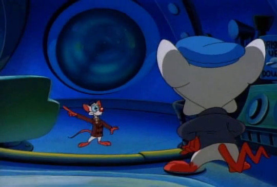
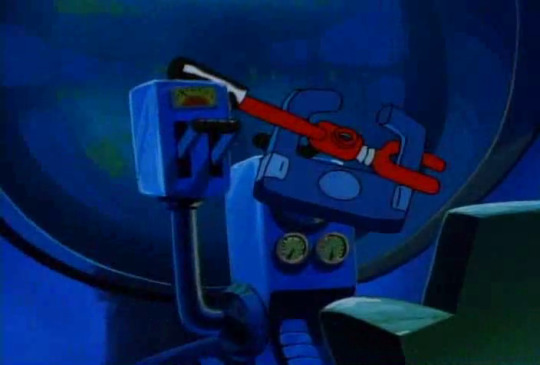
well that’s a bastard. brain blames “the sub club”, which i’m sure he knows a lot about BECAUSE HE’S REALLY INTO SUBMARINES, MR PRESIDENT, PLEASE WITHDRAW YOUR MEN

and pinky works out that he can dislodge the wrench-- the submarine clamp??? the county council clamped their submarine for overstaying their welcome in the library submarine park???? - enough for them to make right turns, but not left. inconvenient, but doable.
but before they can set off, brain directs pinky to the radar console.
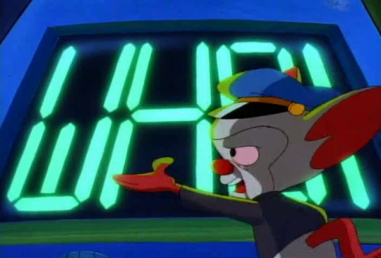
this apparently stands for Woods Hole Oceanographic Institution, and is their special signal that they would use to trace their submarines for oceanographic purposes. brain requests that pinky randomise the signal so they’re not followed.
a difficult job? sure. good thing pinky is a trained sub operator with a good few years of experience.
.....you can literally see him operating the submarine a few pictures up. stop looking at me like that.

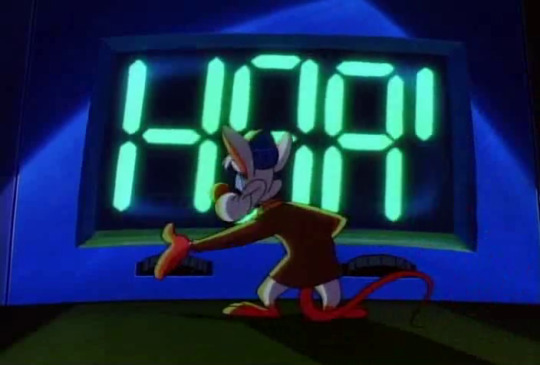

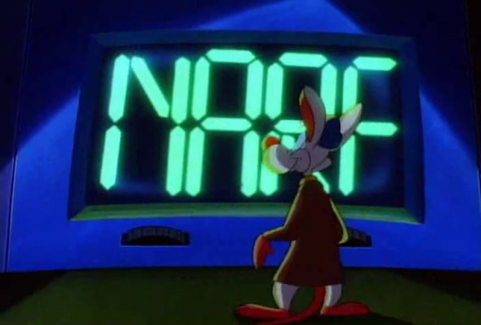
with a few minutes of careful handiwork, pinky successfully scrambles the sub’s internal computation, and leaves it probably a little dazed and confused.
good thing ‘narf’ doesn’t actually mean anything, in this universe, apart from being one of pinky’s verbal tics?
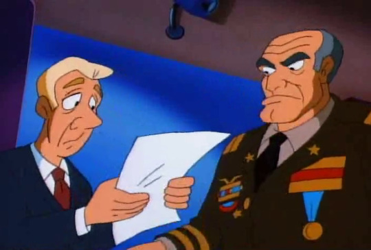
oh dear.
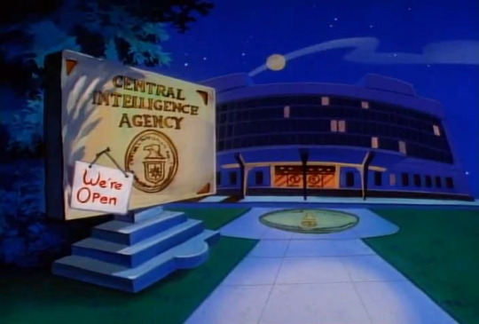
turns out that the CIA have found the submarine, and have realised that it is, for the most part, unidentified, apart from the letters NARF.
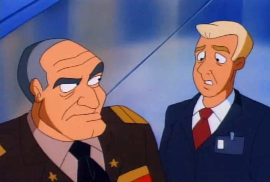
“have you ever heard of jack mcguire?”
“captain, north atlantic. cold war nut. he was discharged-- always saying that when the enemy arrived, it would be with some mythical--”
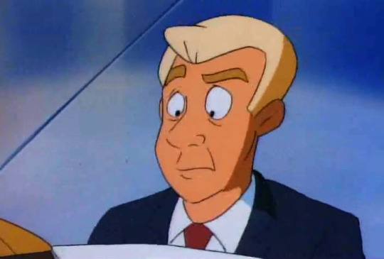
“nuclear attack readiness formation.”
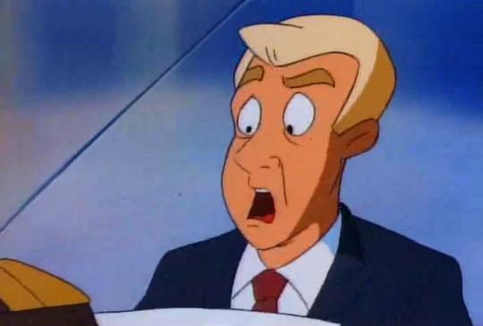
“narf.”

“the old man is concerned.”
“the president?”
“no, just some... random old man.”
so dearest “jonesy” (blonde) is instructed to track down jack mcguire in hopes to get rid of the submarine. because nobody can track down a sub like jack mcguire (hm) and “the boys want that thing terminated.”
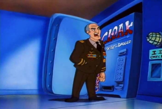
“you mean the pentagon?”
“no, my two boys, josh and aaron.”
meanwhile, at the sub club, brain plots their course for the titanic.

see they’re here,
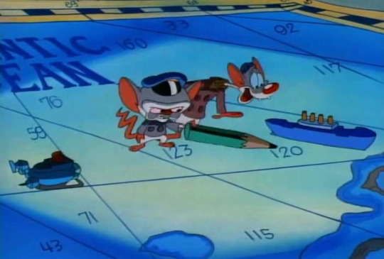
and the titanic is there,
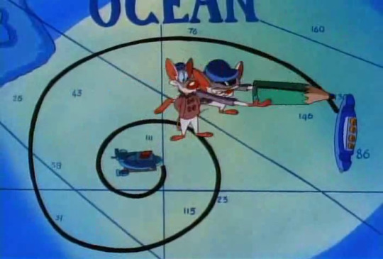
but they can only make right turns, so what should be a two hour journey will take, by brain’s calculation,

“seven months.”
“well. that’s a bit longer, then. isn’t it.”
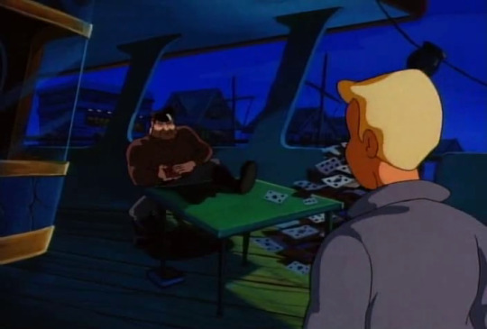
“are you jack mcguire?”
“who wants to know?”
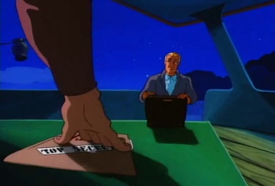
“the cia. got a job for you. there’s a sub in the water, and they want it terminated.”
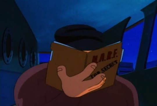
“ha.”
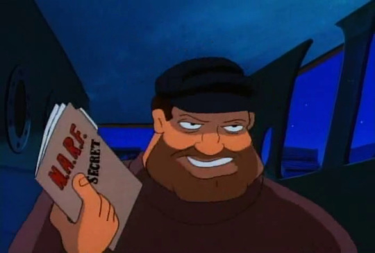
“so the boys finally saw it my way, huh?”
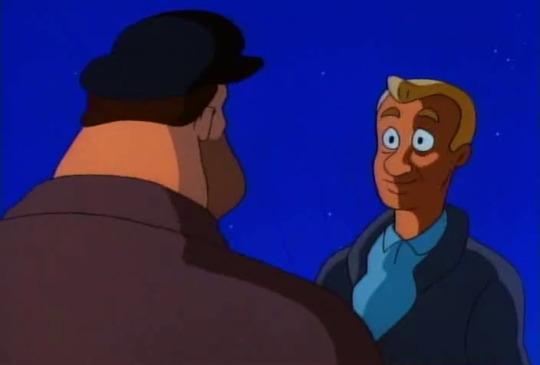
“the pentagon?”
“no. josh and aaron.”
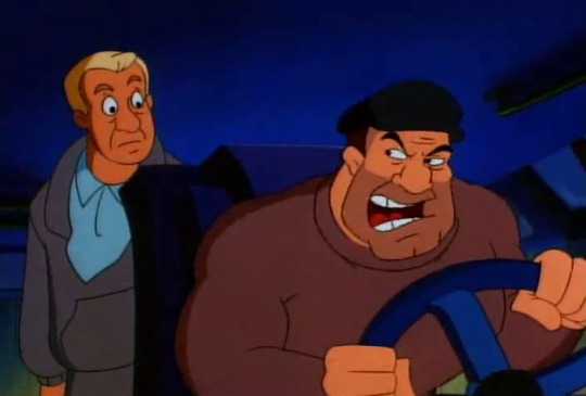
“hold onto your newtons, desk jockey. we’re going sub hunting.”
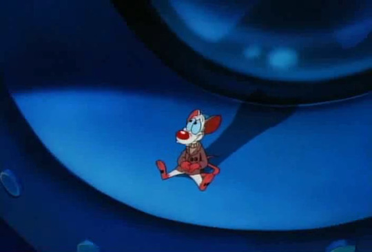


“how long have we been at sea, brain?”
“seventeen minutes.”
it turns out that pinky is so bored that if he doesn’t do something soon, he’ll die. please, brain. this is also me whenever i have to spend more than half an hour in the car.
brain suggests that he tries to improve his pancake recipe, and pinky can try it out for him.
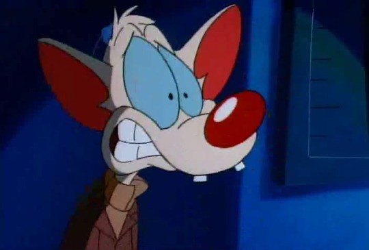

pinky decides that actually, he’s busy, thank you very much.
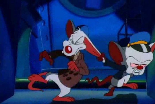
no dice.

“i’ve got another reading”, says jonesy, in the meantime.
“go.”
“4-6-0-0-5, bearing 2-2-7.”

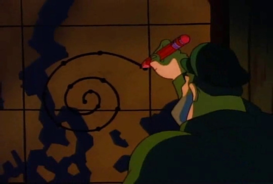
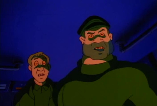
“they’re running the nautilus.”
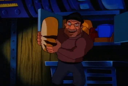
“the what?”
“1943. german boat captain heinz grindelwald evaded destruction by running a circular course, based on--”
“a nautilus shell.”
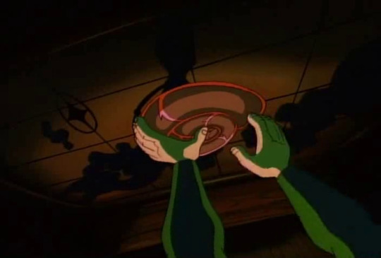
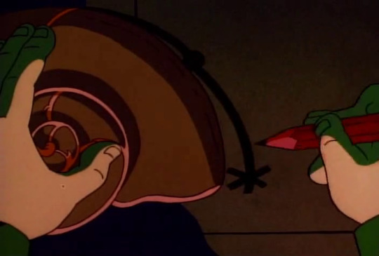
“so we cut them off.”
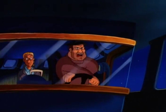
“whoever these guys are, they’re good. they’re probably plotting a missile trajectory at the oval office as we speak.”
meanwhile, pinky throws up.

“well? any better?”


i hope that answers your question, brain.
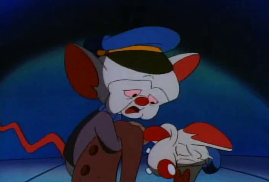
“pinky! are you alright?”
cute!
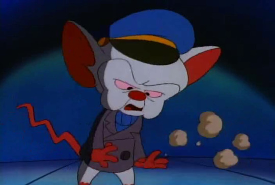
he does drop him immediately after pinky confirms that he is, indeed, still alive, but it was cute while it lasted.
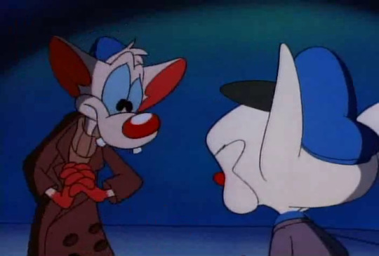
“why don’t you let me try making the pancakes yummy, brain? my mother fed us very well.”
“please, pinky. you’re practically the poster child for cheese whiz.”

“pleaaaaaaaaaase.”
(he gets to make the pancakes.)

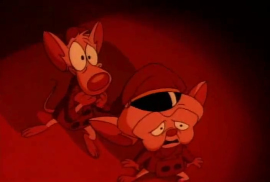
because they have bigger problems now, presumably!
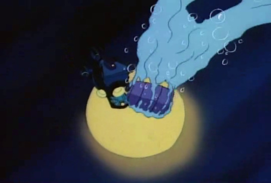
that can’t be good.

it wasn’t!
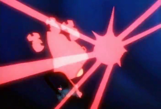
and neither is that. brain laments that “someone is dropping death charges,” while pinky goes and shuts down the engine.
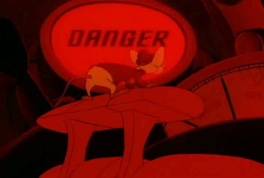
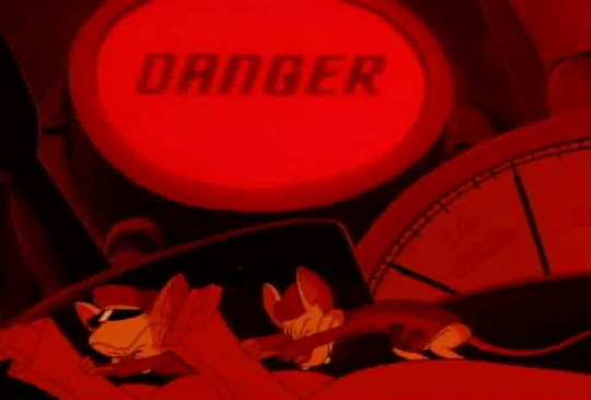
the sub operator saves the day once again.
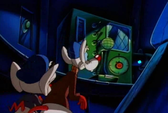
“THIS IS CAPTAIN JACK MCGUIRE. IDENTIFY YOURSELVES OR BE DESTROYED.”
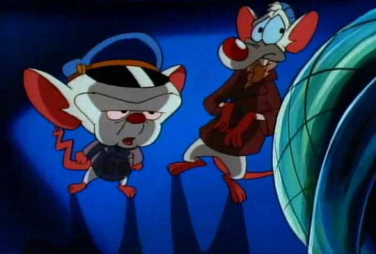
“this is..... jacques cousteau.”
“really. can you prove that?”
“here, ze ocean is teeming with life. but everywhere, there are signs of man’s encroachment.”
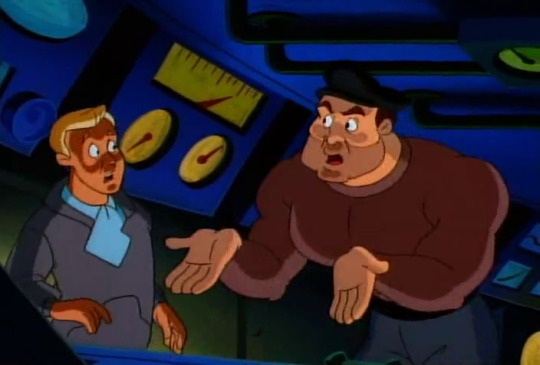
“darn! it is jacques cousteau!”
unfortunately pinky decides now is a good time to chime in with a “haha, nice cousteau, brain” so jack declares that his “little ruse will cost him.”

“i must admit. i admire your skill. perhaps in another time, maybe we could have been friends. we are very much alike, you and i.”

“i doubt that.”
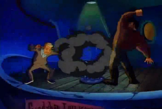

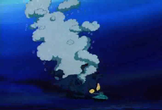
so mcguire fires another charge, and the mice go down. ocean mice! sink.
):
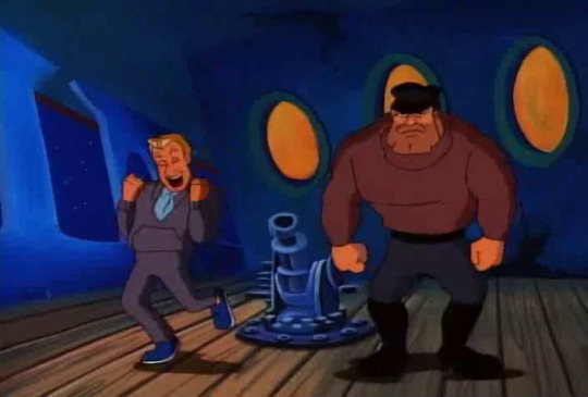
“haha! yeah! we did it!”
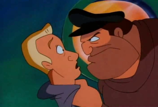
“i get no joy from the demise of another man.”

“....usually.”
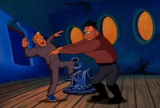
“HAHA YEAH WE DID IT YES YES YES WE GOTTEM WE GOTTEM WE GOTTEM”
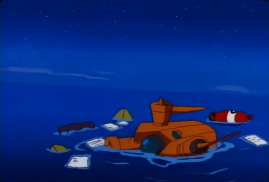
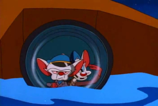
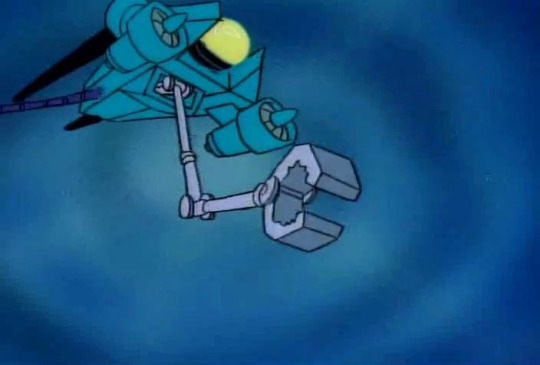
(”take the jason hr on ahead full, mr pinky.”
“aye aye, captain brain.”)
conclusion:
this is a long episode.
still, now that they have a vehicle that steers properly, the boys seem to make it okay.

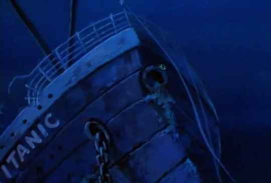
“we should be approaching the hull of the titanic at any--”
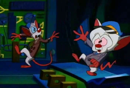
DONK.

“naaaaaaarf.”
“yes, pinky. soon we will have the white crabs of the titanic, and then,”
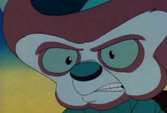
WE SHALL HAVE THE WORLD
“about that recipe, brain, and, um, getting rid of that bad taste--”
“not now, pinky.”
“but brain?”
“just cut it out.”
“oh! aye aye.”
hm.
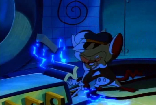
so the mice bodge an air pressure mechanism to yeet the titanic to the surface. as you do.

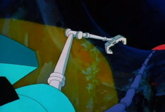
“but brain, the icky stuff--”
“i said cut it out, pinky.”
hmmmm.
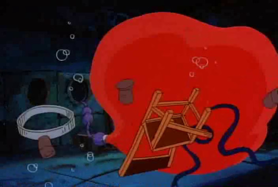
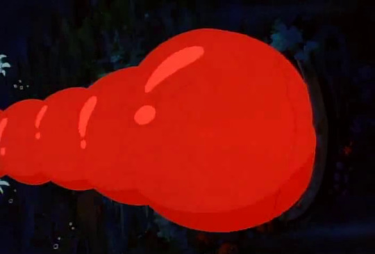
the balloon expands, as balloons do, and the titanic wobbles a bit.
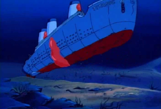
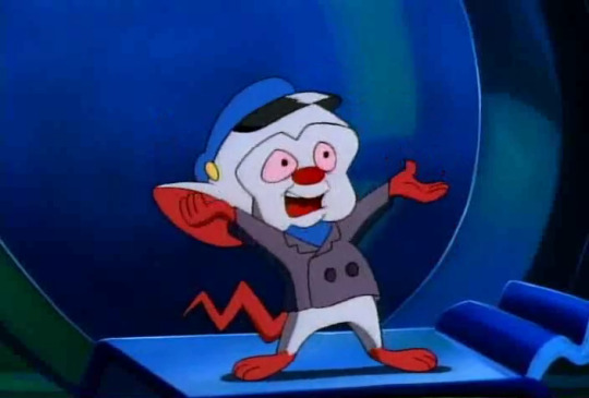
RISE, LITTLE ONE, AND BE FREE
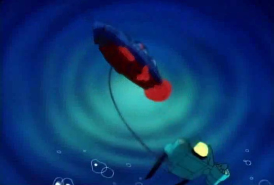
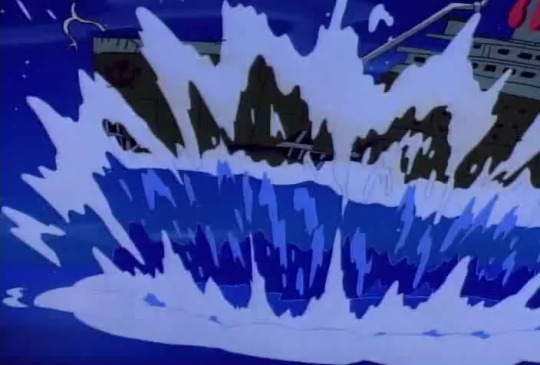
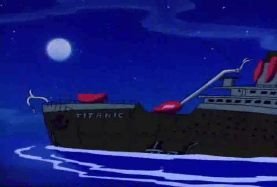
neat!
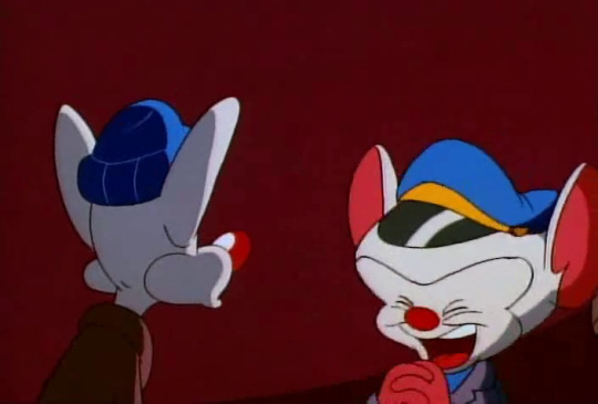
“our journey is almost at at end, my friend! we release the air and propel the ship!”
that’s a very cute happy face!
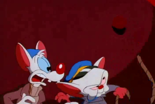
so brain does exactly that, and the titanic farts itself over to california.
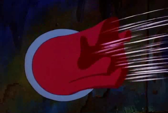
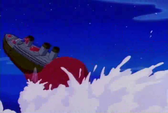
i’m not exaggerating.
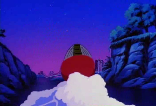
perhaps brain feels vaguely at home on the titanic. he has vague memories of being drunk out of his mind, and bathing in a sink. best not to unpack that.
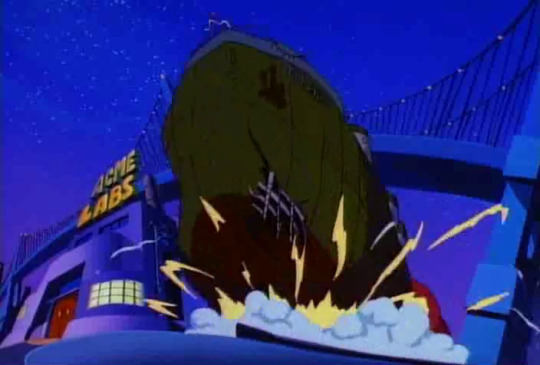
instead, he decides to crash it into acme labs. for the lols.
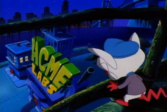

“yes!”
(:
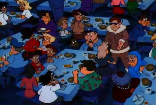
the pancakes are jamboureeing. it’s very cute.
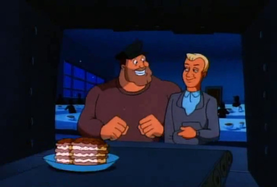
jonesey and mcguire are here too! “nothing like a pancake jambouree after blowing up a sub, huh.”
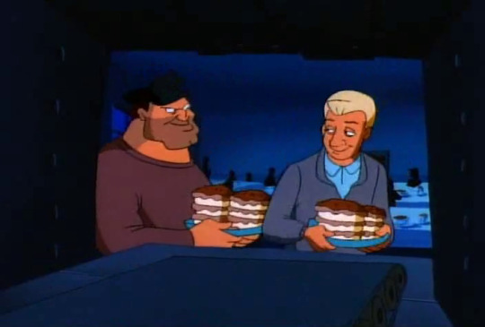
they’re dating now, i guess. i mean, i hope they’re dating. they should be.
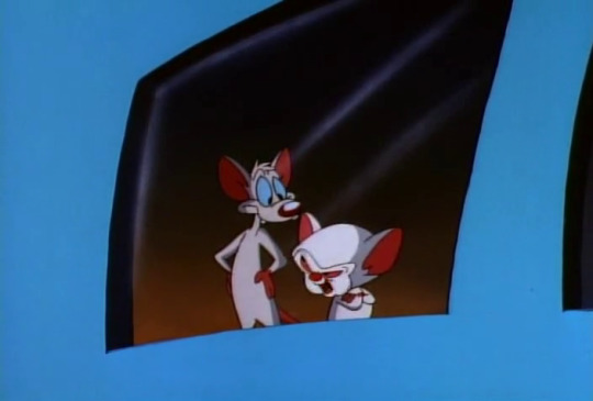
“as the hypnotic fluid winds itself through the minds of our friends, they shall return, happy and content to have us rule over them.”
“well isn’t that nice,” says pinky, in a very condescending manner. “narf.”
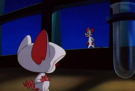
“but tell me, pinky, about your pancake batter. how did you manage to hide the taste of the hypnotic sapo?”
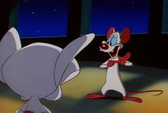
“well, the hypnotic stuff tasted terrible, brain. so like you said. i cut it out.”
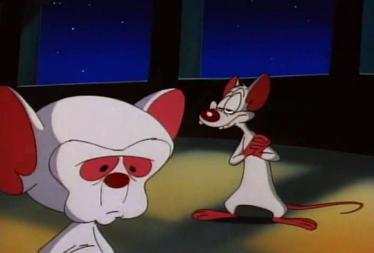

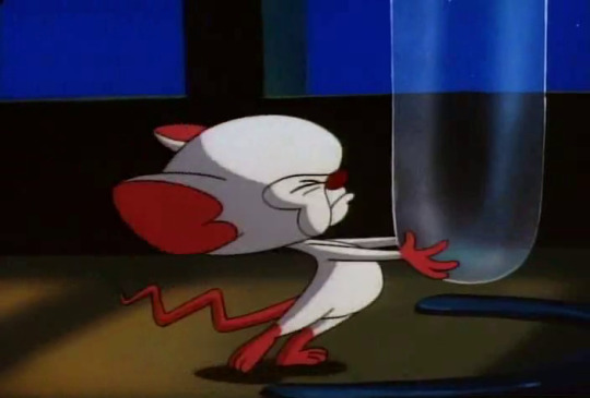

bonk.
anyway this one goes to pinky because he is emotionally intelligent enough to A, understand sarcasm, and B, to know and/or remember what the plan was in the first place. perhaps he deliberately threw it out to make sure nobody had to eat bad pancakes? honestly, i don’t blame him. pinky, defender of the earth.
brain: 4 ½ pinky: 6 ½ outside influence: 10
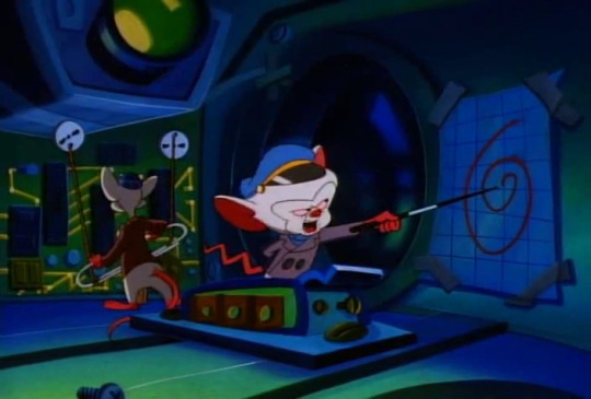
“here’s our course. heading 3-2-9, depth 100 metres, bowplanes at 15 degrees. any questions?”
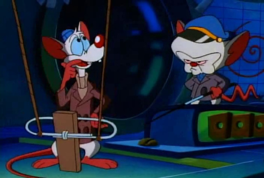
“um. if you could be any animal, what would it be.”
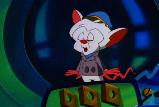
“oh, i’d have to say a hawk, pinky,”
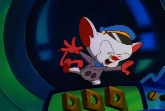
“so i could soar through the sky,”
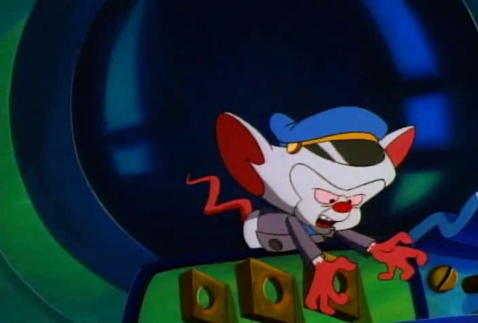
“and grab tiny white mice in my claws,”
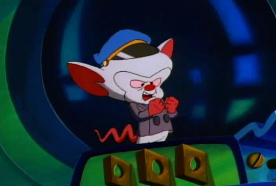
“and feed them to my young.”

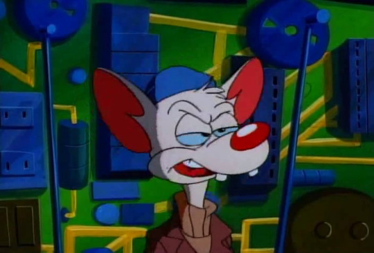
“that’s just... weird, brain.”
28 notes
·
View notes
Text
Typography workshop
Today we worked at expanding our knowledge of type and how we can use our choices in font design to communicate what the word means without needing to read it. To do this we researched the history of type and how different parts of history have change the way letters look, for example adding serifs to your type makes it have a more olden days theme to it due to serifs being much more common hundreds of years ago. We also used collaging to further communicate the word chosen.
The history of type
Type is constantly changing but has developed a lot since the beginning of the practise of reading and writing as now we have may different fonts and styles of writing, even down to us now having vast more variety in colour of ink and more access to them.
The creator of the first typeface was Johannes Gutenberg, and it was based on the scribes that the monks would write by hand, as before printing, the monks would have the job of scribing everything, which obviously wasn’t very time efficient and would cost a lot of money. The type was called “blackletter” and had very thick vertical lines paired with very thin horizontal lines, which worked very well when the monks scribed it but worked bad when printed due to the extreme contrasts between the thicknesses.

A fix for this was created by Nicholas Jenson, with the creation of “roman type”. The name and design of this typeface was inspired by the writing he would see on ancient Roman buildings, with the basis being straight lines and regular curves. It is extremely legible when printed and therefore worked well in replacement of blackletter, and had huge success at the end of the Renaissance.

After roman type, Aldus and Manutius created “Italics” at the end of the 15th century, a stylised of roman type with slanted letters. When it was first invented it was as a means to fit more letter onto a page and save money, but now they are used as a way to create emphasis as they are used sparingly within normal roman type.

Not a lot changed for a couple hundred years until the 18th century when William Caslon created “old style” a style of type with fixed serifs and low contrast between thick and thin lines, making it a new standard for the legibility of type. A serif is a small line at the end of the major lines on a letter used on all lettering in the early days of printing and writing but isn’t as common nowadays, despite still being used in most publications and a lot of fonts.

Following old style, Baskerville made what is now referred to as “Transitional” typeface, which has thinner serifs and more contrasts in comparison to old style. Didot and Bodoni soon after made “Modern”, which contains extremely thin serifs and the highest contrast out of the 3 typefaces. These are now the three categories in which most serif typefaces will fit.


Eventually the serifs were removed by William Caslon’s great grandson, creating “sans serif”. This is very common now and is the type of typeface I am using right now, but it didn’t catch on at first, despite finally gaining traction during the 2nd industrial revolution, which was a big turning point within the growth of type. During this time sans serif fonts were used a lot on billboards as they are so bold and easy to read. This led to a lot of experimentation with serifs and the creation of “slab serif”, which had very thick serifs, perfect for titling.


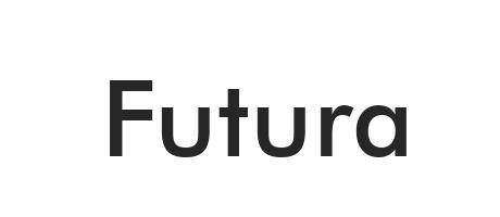
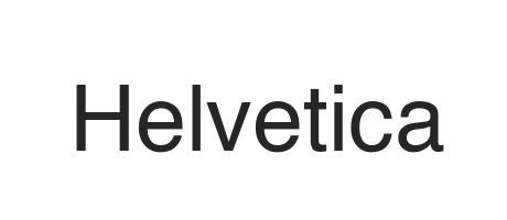
As a backlash to 19th century typefaces, in the early 20th century Paul Renner made “futura”, a simple sans serif font based around geometric shapes, therefore nicknamed “geometric sans”. Other sans serif fonts similar to this were created following futura, the first of which being “gill sans” made by and named after Eric Gill. It is a version of futura with more natural and less harsh curves, and therefore is commonly referred to as the humanist sans. Finally there is Helvetica, made in 1957, containing simple curves and being available in many different lines weights, this type is deemed “the world‘s favourite”.

The introduction of the computer was the final big step in the development of type, with the first type on a computer being pixel type, a very crude and rather ugly form of type which directly reflects the quality of the computers at the time. As technology got more complex, they became an aid to create new typefaces, not a hinderance, and now we have a vast variety of typefaces available to us at the click of a button.

After researching the history of type I thought about how I could use this information in my own work. The direct link between pixel type and computers could work well in my own work as most articles I chose concern technology. If I did want to include serifs in my work I would use slab serifs as they are a more modern take on serifs. I will avoid serifs similar to those seen in blackletter and roman type as they aren’t very modern and therefore could communicate the wrong message within my work since the technology discussed in the articles I have chosen is very new. On the other hand, serifs like these could work well when representing the articles about mammoths and the CIA fly spy from the 70s as they are both about thing which are from a longer time ago and these typefaces could represent that.
Inspiration
When thinking about the second element of my typography work where I would be creating collaged elements to my type, I wanted to find a piece to take inspiration from, so I went to Pinterest and found this piece. I really like the simplicity of it and how it only contains a couple different photographs spliced together as I think it is very effective in corresponding visually with the word which is displayed in a ransom note style at the bottom of the piece.

There could be many meanings of this piece and multiple ways to interpret what her crisis could be, the first idea I had related to mental illness, the blue sky being clouded represents her state of mind being dull and depressed, and the mushroom cloud being in the middle could be a visual communication of being in a state of panic. The other idea I had could be that the crisis is a war, as the vintage style of the collage is similar old war propaganda posters, and the mushroom cloud could be the worry she is having concerning the war or even just something she has seen and is having a crisis about.
I also really like how there is a minimal colour palette due to the muted tone of every colour used and the block colour of the negative. This makes me consider how much the colour I use in the negative space should inform the decisions I make for the rest of the colours I use. Overall this piece has inspired me to take a more minimal approach to my collages.
My Typography
When beginning my type I wanted to consider what I had learned from my previous research. For my first piece I chose to make it in a pixel like font as this style can directly link to the technology aspect of my articles as it was made on computers. I made it distorted so as to replicate glitching you could possibly experience if you had been hacked and I think it works well to represent the word because it is simple enough to easily get the point across.
I chose the word “hacked” to relate to my story concerning a brain chip to connect people to social media, as a big flaw in that product was how easily people would be able to hack into peoples brains with it. I added binary code coming off the word to relate to this further as if the coding is breaking.

If I was to fix some elements of this, I would use a rule to make sure the letters are straighter to emphasise the uniformity that is being broken by the hacking. I would also use a black pen instead of graphite as it is very faint in areas and is not a consistent tone which is not what I wanted, although it could be said to add to the glitchiness. I do think this piece was successful in representing the word but it isn’t to the standard I would’ve liked.
For my second piece I chose the article I have about botox curing depression. I chose the word “botox” as I felt I could effectively represent this visually with needles and clean lines, making it look precise and surgical. I chose to keep it mainly black and white with one element of colour as hospitals and medical places have to be very sterile and bright white can remind people of cleanliness. The orange I added to the middle needle reminds me of David Foldvari’s work and the way that he will only add one colour and I think it looks very striking, working to break up the monotonous black and white.

I chose a sans serif type as they look very sleek and modern and therefore I believe they work well for the subject matter. I also like the simplicity of the needles and how they are the same thickness as the lines in the letters, making them work very well in place of the lines I made them replace. If I was going to improve upon this I would maybe add more elements to the negative space that relate to botox, I could also have mad some of the letters look like distorted faces to show the aftermath of modifications.
When beginning my collages I wanted to take into consideration how simple I would keep it, so for my first collage I only used a few different images. The first image was of a woman who’s face I cut out to replace with metal imagery to make her part robot. This relates to the same article as I chose for the “hacked” type as the idea of adding an implant to someone’s head could make them into a part robot part human being: a cyborg.
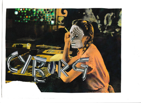
I really like how the face looks and I think it works well along with the word I chose. The darkness of the background makes the metal texture of the word “cyborg” really stand out and the warm yellow tones contrast the cool grey. For the word I collaged some metal pipes I found in a magazine together and I think they work very well although if i was to change anything about this I would maybe draw more parallels to the human side of cyborgs due to that being slightly lacking in this in my opinion. To do this I would maybe make half of the word flesh coloured to display that a cyborg is a mixture of both.
For my final collage I used the collaging aspect to make the break up the white in the background. I chose black and grey as this piece was based around a cure for blindness and the darkness could be representative of what blind people see. I then wanted to add different textures to this piece, so to begin with I closed my eyes and wrote “blind” with an oil pastel to create a rough texture in my work whilst also still relating to my chosen article by how I chose to write.

I also added some braille to further tie in to the idea of blindness a this is the form of alphabet that blind people read in. I don’t like the uniform letters I added over top of the crude oil pastel writing and if I was to change any part of that area in this piece I wouldn’t have added that as I don’t think it particularly links to the word. I also don’t like the ransom not style word towards the bottom of the piece for the same reason. I do like how it looks however, and it reminds me of the piece I found to take inspiration from off Pinterest.
I really like the contrast of the white eyes on the black part of the the piece and the style of type I chose to put in the eyes, as it has slab serifs so still looks modern and can relate to new technology despite having serifs. Overall I somewhat like how this turned out although I should’ve been more considerate when adding certain elements and thought more about how they would further portray the narrative I was creating.
1 note
·
View note
Text
↬ what scene will you be?
date: early 2017 / january 2020 / august 2020.
location: some random apartment / ash’s home studio.
word count: 1,875 words, not including lyrics.
summary: n/a.
triggers: passing mention of alcohol.
notes: creative claims verification. mentions of youngjoo 🥴 but in the least angsty context yet! some parts in the middle are repurposed from a defunct verification.
early 2017.
the concept of the song first comes to him early in his relationship with youngjoo. there’s something about the beginning of a new relationship that never fails to bring out inspiration for a flood of love songs from the depths of ash’s mind, and youngjoo is the perfect muse for his poetry in the midst of the fluttery, dreamy feeling of their honeymoon phase.
they’re watching a film, a surprise date night planned out by ash that had involved talking a senior friend into letting him have his apartment for a few hours that evening (which, he’d like to note, had been incredibly hard to do when he couldn’t explain why he needed it). he’d set up a projector in the living room and a film he knew she liked and he’d gotten an expert opinion on a good wine pairing for the dinner he’d made.
it’s strange, dating youngjoo, but it has nothing to do with discomfort in his feelings for her. she’s youngjoo. smart, successful, talented, kind, interesting in a way that keeps him captivated from the moment she walks into a room, and gorgeous in a way ash hadn’t been able to ignore even when friendship had been all there was between them. he could listen to her talk for hours about anything in the world, and he wishes he had the time to do just that. she’s every color in the world and ones that haven’t been discovered yet, and he watches her more than he watches the movie.
every time a slight smile curves on her lips, his heart beats faster and he swears goosebumps raise little peaks on his skin.
the greatest film on earth couldn’t possibly compare to an evening spent in youngjoo’s presence. given the chance to own all of the greatest art in history, he’d reject it if he could spend evening upon evening with youngjoo by his side instead.
he loves her.
he hasn’t told her yet. it feels too early, but he knows he does. there’s no other way to describe the elation that fills him at the mere thought of seeing her or the fact that she’s his last thought every night before he tries to sleep.
he writes the chorus in his mind as he sneaks glances at her, and he puts it down onto paper that night after returning to knight’s dorm, a rare smile on his face and the feeling of their kiss goodbye lingering on his lips.
january 2020.
the song had been abandoned in ash’s files after he’d broken up with youngjoo, deemed unlikely to ever be dug out again.
he finds it again on an old hard drive he digs out from a box he still hasn’t unpacked after coming home from another meeting with bc about the singles he’d be releasing throughout the year.
these kinds of meetings with this frequency had only become common in the lead up to fatalism. he hadn’t had so many meetings for daydream, he’s sure, but then again, he’d put a halt to all of those when he’d injured his ankle that year. he can’t quite remember the frequency of meetings for i’m young, but that had been his first album and his first chance to prove himself. by now, bc and the other producers should have more faith in him than they seem to.
they’d talked again about image. sexy had been their plan for fatalism, but it hadn’t been the success they’d wanted and ash is known for his heartbreak ballads after the success of “untitled, 2014”, not to mention “d (half moon)” outcharting anything that could be considered sexy on his last album. it’d be terrible business practice to abandon that entirely for a new image that ash had been pulled into simply because sexy performance soloist is currently a less competitive market than acoustic love song ballad singer-songwriter. there are so many of those, but the performance soloist category is more dominated by female soloists these days, so by growing his image, they could assure ash is able to become a household name instead of just another disposable singer, they’d said. the company wants to bring in the kind of brand ambassador money that comes with standing out instead of blending in. with the way he works day and night at events that drain him of every last ounce of social energy to please brands, ash would think they’d be happy with his current status, but it’s a mistake to think a company can ever be satisfied in their greed. ash doesn’t want to care, but he can’t help but feel a little prideful that they’d apparently been wrong... if he ignores the success “troublemaker” and “now” had had last year.
it’s been a couple of months now since ash had had to fight for his own input for the album concept. some of the tension in the reins has been slackened in response to romanticism not being the smash hit they’d wanted. ash is still struggling to pull himself out of the mindset he’d had to live in for fatalism, though, and it’s rare something entirely fresh comes to him.
this isn’t fresh either, technically. it’s nearly three years old and based on feelings long past, but as he listens to the track, he’s struck with the feeling he’d been onto something and he saves it to the computer in his studio to come back to before checking that his schedule is clear for some time, so he can and hole himself up in his studio with some hope of being able to work uninterrupted.
this isn’t going to be the song he’s supposed to be working on. maybe it could work for his spring single, but that seems far-off now.
he sets to work and the song soon expands its references to a lover as a film he can’t take his eyes off of. he hadn’t latched on to the initial metaphor too deeply when he’d first heard it since the memory that had inspired it is so far in the past now, but the feelings that start to crawl their way out of him so naturally keep the idea from going entirely neglected. more than the lyrics, he focuses on what to do with the instrumental. the original draft had been simple in melody, acoustic and sweet, like a lot of his music had been when he’d only been in the beginnings of creating anything good enough to win bc’s approval. (it’s bitterly funny how that’s a battle he’s still fighting in spite of his style changing so much since then.) now, a more refined composer and producer, ash switches up the style entirely to something more unconventional and syncopated and in a style he’s wanted to try but has never gotten the chance to up until now.
it’s upbeat enough to be make bc happy with the possibility of a more choreographed stage (though, in ash’s opinion, it’d be a good song to stand and sing on stage with only a microphone stand and background projections), but in a way that’s not shoe-horned in for the sake of achieving what anyone else wants. he’s written so much heavy music lately, weighed down by angst or lust or anger or resentment, but this is pure. not pure in the way he would have thought to make it three years ago, but it’s love re-invented, taken from a confessional letter to a musical story of a man he doesn’t entirely identify with anymore.
it’s a project he spreads out over a few weeks, coming back to it whenever he wants to play around with something exciting instead of nailing himself down to another song that’s too much like something he’s made or heard before. as more work comes in with deadlines, at some point in the working process, he abandons it. be it fun to work on or not, he’s a seasoned professional now and it’s more critical to meet deadlines than finish some conceptual track that probably won’t even be used.
august 2020.
months later, ash is more focused on the creation of his next album than anything else. it’s been pushed back once already and every time he tries to make something new, it comes out the same: an alternative r&b track and heartbreak or longing. he’s getting nowhere, so, one day in his studio, he re-opens that “concept track” he’d left to the dust and spiderwebs months earlier. he already knows precisely what he needs from it.
he has a vision for the full song now. it should be the sound of a relationship that’s still passionate and hesitant like early love so often is. a movie that draws in the eye and the ear and the mind from the very beginning, but as it progresses, it turns inward.
if a lover feels like every great film every written, how long can it last before you’re left questioning how that’s something you deserve? if a lover is every color in the world, how do you ever know what their true colors toward you are?
when he’d first begun writing the lyrics, it’d been so hopeful, but he knows now where that hope had led him.
the song isn’t meant to be dark, so he keeps the wonderous tone, letting the worry set in only as the song leads itself out.
what scene will you be? some day, will our story be told by others? who will be the next lead? what if i’m just a cameo? should i just sit in my seat?
all that the song really needs now is some additional production work from him and it could be submitted to be slotted into his new album. it’s different in tone from everything he’s submitted so far, but that could be exactly what the album needs that it’s evidently so direly missing to be truly complete.
he sets to work recording final vocal tracks for the song, or what will be final unless it’s approved and bc sends him in for a cleaner take. he keeps his delivery light and entranced, like he’s whispering to himself out of fear of being overheard. the more he tries to connect to the song, the more he realizes how hard it is to do so without thinking of youngjoo. it’s so uniquely her. or rather, uniquely him when it comes to her. the feeling of someone entrancing him so completely, like someone he isn’t deserving of experiencing, is one that he’s never felt in the exact way the lyrics and music convey with anyone else.
so, he lets himself think of her, of their past and their present and how fleeting any moment in time has ever been between them, if only for the sake of getting a successful recording.
the ending of the song hits a little too strongly when he does that and his delivery becomes more rushed, barely keeping in time with the beat as the questions rush out of his mouth. he takes a break and stops himself from getting too deep into the insecurity he’s trapping himself into needing to access.
he considers changing the end of the song, but he can’t imagine it ending any other way. that’s the story that has to be told and he needs to tell it, even if it all hits closer to home even now than he’d like to admit.
#fmdverification#the number of verifications mentioning youngjoo is getting embarrassing now#this one wasn't even supposed to mention her and look where he ended up#*we#there are at least four more that have to mention her.... it's okay i hate ash too#&& when you're screaming but they only hear you whisper | self para
1 note
·
View note
Text
October 2019 marks the 30th anniversary of the Quest for Glory video game series, so what better time to write a bunch of words about it?
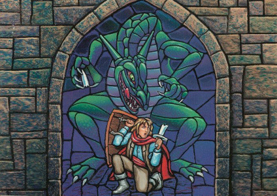
It was a game that I played at just the right time in my life to embed itself into my psyche. I was already a lifelong devotee to the Sierra adventure games at the tender age of 12. I learned to type by guiding Rosella via text parser around the land of Tamir to save her father. I read the King’s Quest Companion until the covers fell off. I subscribed to Sierra On-Line magazine, and was briefly pen pals with Roberta Williams (and once received a phone call, to the surprise of my mother who did not know why an adult woman was calling her 10 year old daughter). It was in the Sierra On-Line magazine that I first noticed an ad for the Quest for Glory Collection.

I saw the game one day at the mall with my dad, and casually asked him to get it for me. I wasn’t really expecting much, but hey, it might be fun. Previous references to the series had always looked too grown up to interest me, but now I was a pre-teen! I was ready for cool fantasy action!
I started up the first game in the Collection and was instantly hooked by a deeper fantasy world than anything I’d ever played in before. I could click on anything and get a funny description, I could get lost in the forests of Spielburg, and I could daydream about the bigger world that this little game alluded to.
And the best part? That bigger world was right around the corner in the next game. My hero and I journeyed together from one land to the next, in each game reading about the other far away kingdoms that lay ahead of us in our adventures. We jumped from game to game together while getting stronger and wiser, and his friends and enemies went on our journey with us, living their lives in what felt like anything but a static game world.
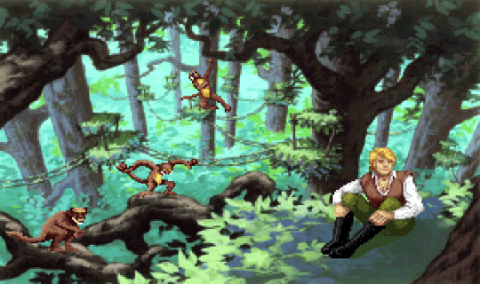
Full disclosure: I found these particular pixels very handsome at 12 years old.
They were the last games that I played with my childhood best friend before we drifted apart. We would huddle around my computer all night, walking my hero into traps and laughing at all the funny death messages (this is where I learned the word strychnine). We copied the games onto her computer so she could do the other character class paths- I always went for mages and paladins, while she was more of a rogue type. Since then, there has been a litany of people that I have tried to suggest them to, but a 30 year old adventure game series is a hard sell for a lot of people. My first boyfriend, a friend or two, and my husband make up the entire list of people who got through the first game at my behest and then never continued. They just can’t quite see what I see in these dated little games...but then again, they only played the first one. The first in a series is rarely the star of the show. I wonder if they saw the puns scattered liberally about, the fairly straightforward fantasy quest, and decided that was probably all that was there.

They never went through getting the Prophecy at the Temple of Sekhmet, a somewhat fourth-wall breaking event that felt like it wasn’t just judging the character in the game, but peeking out to the player and asking who they really wanted to be. Or being beguiled by Ad-Avis, an unsettling event playing on the dissonance between the hero’s happily altered perception and the player’s own knowledge of the terrible trap they are both being led into. They never even walked around the savannah for days without any rations in the inventory only to accidentally stumble upon the Awful Waffle Walker, saviour of hungry heroes across the land.

If you know the flame dart spell you can toast him before eating him.
They certainly never saw my hero slowly fall in love with Erana as he finds sanctuary in her gardens, or found themselves befriending monstrous women like the Rusalka, and Baba Yaga - ladies who are as charming as they are absolutely willing to kill you. The women of the series are a standout- and not just for the time that the games were made in. They are varied and memorable and fun, sometimes allowed to be vulnerable in a very human way, and never there just to be a checkbox for the hero to rescue or win (ok, I guess there is one woman who is literally a tree that you can revive, but even Julanar is interesting). A friend of mine remarked several years ago that she never liked being a girl while growing up, because there were never any cool girls in tv shows or video games. It had not occurred to me until then that all of my favorite things as a kid were created by women, and I had never felt left out the way that my friend did. While Quest for Glory obviously had to cater to its most visible audience of young men, the hand of Lori Cole is strong at the helm beside her husband’s.
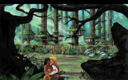
...which isn’t to say there’s no romancing cute girls. Hey, who can’t enjoy that?
I said earlier that I played it at the precise age for it to imprint on my brain. When I was in eighth grade, and right after the release of the last entry to the series in 1998, I began drawing my first comic series. It starred my hero (who in my game was named Mir) and a companion, a gnome girl based on myself (also named Mir).
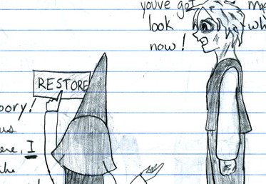
Yes, it was completely dreadful.
I’m still working on it, though.
The story that I’m writing now is unrecognizable from the goofy gag strips that were so funny to me and my friends, but there is still a character named Erana, and there is still a hero that looks essentially unchanged from the paladin that I traveled around Glorianna with. Anyone looking at it who knew of my love for the series would put the pieces together pretty easily. I finished the first version of it in 2003, at the end of my senior year of high school and immediately started drawing a new version. That one lasted 7 years of working on and off, and I drew 217 pages before I gave up, too frustrated with how the story had rambled on and couldn’t go where I wanted it to. The art got better, though.
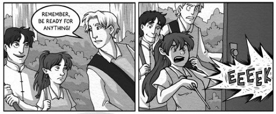
I didn’t give up, though. I still loved the characters that I had been carrying around in my head since 1998, and I still wanted to tell the Mirs’ stories in the best way that I could. A few years after I stopped drawing it, I started writing again, determined that if I started drawing it again, I’d have the whole story planned out, at least roughly. That’s where I am now in 2019. I’m not someone who finishes projects quickly (I’m still working on an inktober drawing set from two Octobers ago). I’ve been picking away at this comic for twenty one years.
I won’t say that if it wasn’t for this game, I wouldn’t have made anything- I’m sure that something else would have planted seeds and taken root, eventually flowering into some other fandom passion project that I’d transform into my own. The company I work for was founded by friends who were all brought together by their shared love of Earthbound, and have created incredible things both directly and indirectly inspired by it. But for me, it was Quest for Glory.
Thank you, Lori and Corey Cole, and all of the other people who worked hard to bring the series to life all those years ago.
39 notes
·
View notes
Note
toons?? Toons?????? Pls tell me about ur toons
heads up,, this boutta be long as fuck!
well,,, if you insist. first of all yes it is a kin thing and no i shan’t elaborate (unless you specifically want me to, then i shall).
so! i have 3. first up… mayhem mania!
mania is a toon that loves mischief and causing problems on purpose. just pure chaotic bastard. but they are very valid and have a big heart which they use to love their friends/found family so goddam much. until some shit happens later on, for a loooong time they don’t realize that like. they forgot an entire portion of their life. to their knowledge, they n the bros have existed for as long as they can remember. but actually ! there’s like. at Least a couple years of their life in toontown prior to that that they forgot about. basically they were pulled through a tv (by swing), dropped into toontown, and forgot their entire life prior to toonification and couldn’t properly retain memories, so they ended up forgetting a lot of their life without realizing it. whoopsie! they end up remembering, tho, after some series of events.
can’t forget the emotional angst, tho! their entire self worth relies on the approval/acceptance/love of others, so on their own they have no idea how to be happy. mania be like feels unwanted all the time! mania the funny talkative jokester not allowed to be sad so will stay in house for days when sad and mute! mania be like i will invite myself into situations and then feel bad about doing so but no it will not stop me from continuing to do that bc i have a desperate need to feel included so it is just a never ending cycle ! coinciding w some events previously mentioned, they get better tho :’)
but they love gags, tend to break the fourth wall a lot, gives everyone nicknames (ex. shortstop, buzzer, pinball, etc), and loves to be as irritating as possible. anvils are their favorite, and their trademark. arson’s also quite fun. think… spencer shay energy.
well, that’s enough of that. now onto heartie! this one requires a lot of lore for context, so it’s gonna be long.
heartie is an artie. artie stands for uh *goes to look* “artificial replaceable toon-adjacent intelligent entity.” basically “artificial” toons that’re made for specific tasks and filler pieces (testing (possibly life threatening) gags, musical performances, janitor, selling stuff at disney kiosks, personal butler, etc) that have roles based on a poker chip in their neck! (kind of like a computer chip). they are all numbered and referred to only by “artie” or their numbers, unless given a nickname by their owner. they all have the same general appearance, but are slightly different depending on their roles and can be customized for specific look if wanted. arties are made in factories - and that’s where my heartie comes in! heartie is ARTIE#010, the Head Artie of the main artie factory. he runs the place! his nickname is originally hartie, bc h.artie (for head artie). he’s a little bigger than regular arties (who are in general quite small) bc 1. he’s Head Artie, and 2. he’s an earlier model, which are bigger in general.
arties generally don’t have a lot of freedom. depending on who they’re ‘owned’ by, they have varying levels. heartie didn’t belong to any particular person, more that he belonged To The State. or the company itself, that is. so he had a lot of freedom - when the factory closed, he had his own house that he went home to (v unusual!). however, arties were starting to defect - as you. imagine they would eventually being what they are. this kind of Freaked Out the powerful toons, so what they did was limit them more! so arties couldn’t leave their required workspace. so heartie was stuck in the factory. eventually, when arties were still defecting en masse, they kicked heartie out. can’t trust one of ‘em to be making ‘em, can ya? since he didn’t actually do anything wrong they didn’t recycle him (which is a Whole Other Can Of Worms), but just. fired him? they didn’t really care what he did as long as he wasn’t in charge of the factory. so heartie was left without a purpose/job. eventually he became acquainted with other defected/abandoned arties and became the artie/toon repairman! and his name was changed to Heartie bc he was no longer head artie. someone also gifted him a heart patch that he put over the old company logo on his overalls.
*exhale* OKAY. so for his ACTUAL PERSONALITY LMAO. he’s a very caring and lovely guy. he knows a lot about arties and is a great handyman! he’s friendly n charismatic but also just like A Normal Guy. he also sounds like fix it felix but with less of a southern twang. after being forcibly defected he becomes more impulsive/off the rails, but not in a bad way. just in a ‘no one can tell me what not to do anymore’ type of thing.
mkay. Finally we get to dawn. if the artie thing wasnt weird enough for ya, well, now we’re gonna talk about Gods.
basically for some reason toontown has Gods. dawn is one of em, some sort of goddess of the sky. she has a light pink, rose-gold hair, long and wavy. she has freckles of stars across her face. and!! wings!! big white wings. i don’t have a drawing of her yet unfortunately. i tried to yesterday but was about to lose my mind bc it was hard lkdjfjd
i don’t really know yet what it was she Did (i’m thinking of like. similar to the role of Victory/Nike?) but i know for sure that she was Gay. her parter is iris, god of the rainbow. iris created the concepts for the toonbros and most of the toons i think, and also eventually gave color to toontown!
but basically a. whole slew of things happened and dawn ended up sacrificing herself to save/heal iris, who was basically the god equivalent of bedridden and dying. another god (pinny, who took care of the garden, where each flower represented a soul in toontown and all the alternate universes), took what was Left of dawn after healing iris and put her into a flower and planted it. dawn was reincarnated as a mortal in toontown! her name is summer and i don’t remember much of what happens with her. but eventually iris found her and reminded her of everything, and iris gave up being a god to live as a mortal with summer/dawn. they get married and live out a wonderful gay life as toons.
i made that complicated as shit!!! so if u have any specific questions…………. feel free to ask jdfljdkf tho! probably send em to @mayhem-mania!! that’s m toon blog
4 notes
·
View notes
Text
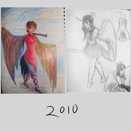
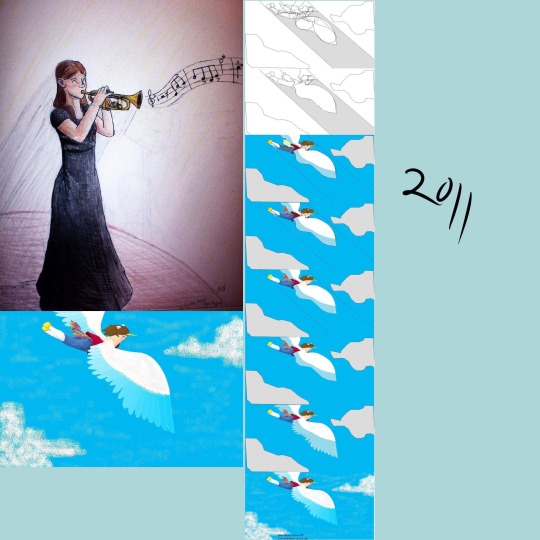
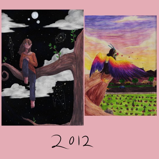
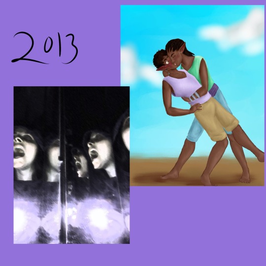
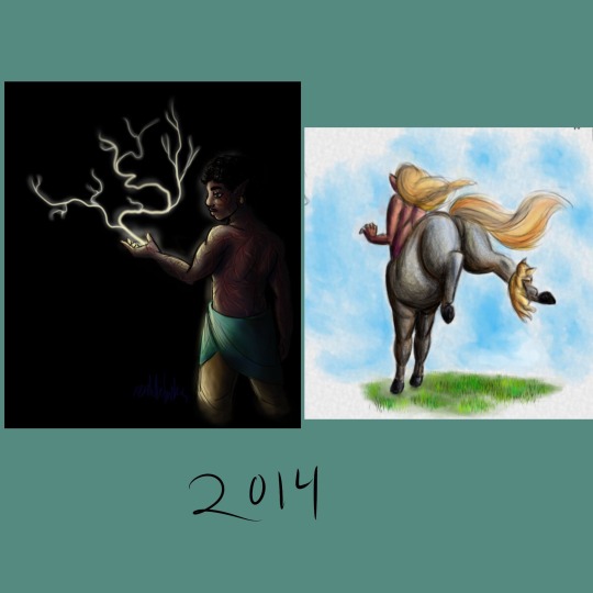
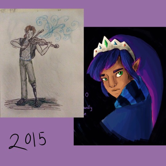
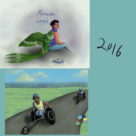

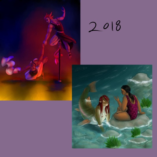
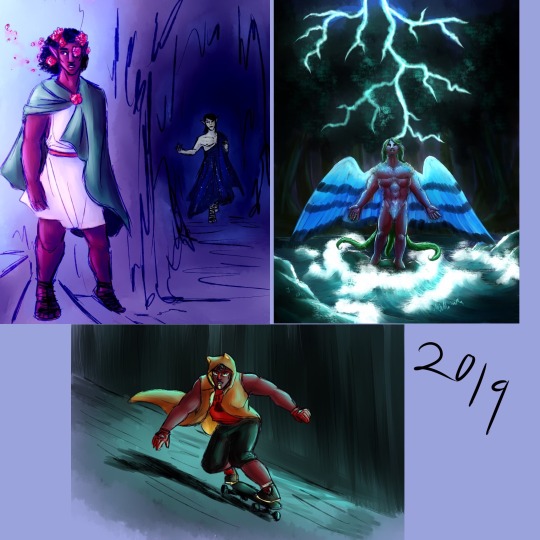
Instead of a summary of my art from each month of 2019 I’ve compiled a summary of my art from every year of this decade! Finding some of that old art was incredibly difficult.
And making an exact image description of all this would be too long to write or read so I’m going to do my best to describe all this in a concise and interesting way.
2010: I was a sophomore in high school, so about 15 years old. These two drawings are in pencil and colored pencil, one of some random girl character wearing brightly colored clothes and a rainbow shawl thing (??) walking on clouds it seems. No idea what that was meant to be about. The other is a reference for my old oc, the very first one I ever had, based on myself. She looks human but with unicorn ears and a horn, plus wings and a tail. I hadn’t figured out animal legs yet either so she has perfectly normal human legs that just end in hooves.
2011: still mostly pencil, colored pencil, I don’t remember if I had a laptop yet. I would have been 16 years old at this time. I picked a self portrait here, a coloreddrawing of myself in black concert dress playing the trumpet because I got to do a solo in jazz band and I was very happy about it. The other art I picked for this year is digital but in the old ms paint program (you know before it tried to be fancy with a few more realistic tools and was only pixel art tools) I do believe I was still using the family computer for this, with a mouse. I was really creative with the tools. It’s my unicorn girl oc again, flying through the sky. I included a progress image, showing how I made it. I’m so glad I saved the steps and posted them it’s really cool to see my old art process for that.
2012: 17 years old, and I think I finally had a laptop with a good art program on it by this time but I still did mostly traditional art, lots of colored pencil work. I found this old experimental art I did that year, a colored pencil drawing of a girl sitting on a tree branch, but the background is all digital, a painting of a fantasy night sky with three moons. It actually looks kinda good, the edges of the colored pencil drawing are crisp and smooth and the digital background doesn’t look out of place. I mean the shading is a bit of a mess and I used white clouds on a black night sky which is a bit funny looking but it isn’t that bad. The other image is a colored pencil drawing that was really ambitious for me at the time. I had this cool idea to draw Death with sunset colored wings, all poetic and stuff. Why did I also draw death with blue skin and horns? I don’t know. Why is death sitting on an ambiguous brown cliff overlooking a cemetery? Well I guess I just was having trouble finding any other way to make a nice background and have death above a cemetery. I should redo this one, it’s a really good concept.
2013: my last year of high school, 18 years old. I was doing digital art a lot more often this year and expanding the diversity of my ocs. One of these images is a digital drawing of two of my first characters of color, two male black elves (black as in African-based) smoochin. My first black oc was also my first queer oc, jayvyn. A gay elf. There are a lot of issues with the way I originally conceptualized his story but even when I was thinking he was the only queer person in his town and there was homophobia towards him (I was only just dipping my toes outside the mindset I grew up in) I gave him a whole massive group of friends (a boys' lacrosse team he was on don’t ask me why lacrosse I have no idea I don’t even know much about lacrosse it was a weird choice) and those friends were extremely loyal and supportive of him, even to the point of going on dates with him just to make him happy. and again, he was the only gay character I had so I was writing a bunch of straight dudes taking their one gay friend on dates in a town full of people who were at least vaguely homophobic, I definitely had a lot of growing to do in my writing and my own mindset but I’m kinda proud of myself for doing that? I could have done so much worse with my first queer oc and my first real step into characters of color, but I made the whole story about this tight knit group of boys who were all such close loving friends. (Gee I wonder if this had anything to do with my being ace and not knowing it yet). Oh yeah, the other image is also there, that one is from a photoshop class I took. We had a three-way folding mirrors the bathroom at the time so I put on a hoodie, turned out the bathroom lights, folded the mirrors in and shoved my face into the gap and then took a photo with the flash while holding my mouth open in a silent scream. The result is this really cool series of screaming faces at different angles, which I then ran through a few filters and major contrast adjustment. Could be an edgy generic horror movie cover lol
2014: 19 years old, and I just finished a year of community college and then left on a church mission for 18 months. I probably should have used some of my first college art class drawings for this year's summary but I was using my old deviantart gallery to collect these old images so I forgot I had all that college art too. These two digital images are pretty dynamic in different ways. Dynamic lighting and dark skin, an experiment I was doing to figure out lighting better for my characters of color. That’s Jayvyn again I think, with lightning shooting out of his hand because I sure love making characters with lightning powers. The other is dynamic in the posing and I’m still incredibly happy with it, it’s a drawing of a grey centaur from behind, bucking in panic because a kitten pounced on its foot. Definitely still one of the best centaur drawings I have ever made.
2015: 20 years old, I was actually on my church mission for this entire year so finding art from that year was very very tricky. One is just a small pencil drawing on another oc, Ronan with his cool mechanical leg playing fiddle I guess? I was doing a lot of synesthesia doodles that year so there are lots of swirly lines coming off the fiddle. I was also surprised to find this really neat digital art I made of Ravio from link between worlds, I almost forgot I did find a way to make digital art on my mission (no access to my laptop, limited apps we were allowed to use, super limited access to normal computers except for emails and such, always busy doing important stuff) I discovered the drawing function in the iPad notes app and every time I had time I would use it until I figured out how to make it work for me, using only my fingers, the limited color palette options, and this marker tool that had one size and only multiplied (except when using white) this is definitely one of the best ones, but I don’t know where the rest went. I had a lot. I was stunned to find this because it really looks like I could have done it on a laptop, can’t believe I forgot I did that.
2016: 21 years old. Had to get used to a laptop again. Also I created my current main oc Morianten during my church mission so here I have the very first full body digital art of him! I’ve definitely changed his anatomy a lot since then, made him much more bird like. Kinda funny to look at this old one and see just how differently I draw him now, only three years later. I also have here a digital painting of some other members of morianten's adoptive family, his dad and little brother having a father son race in nice racing wheelchairs. I still struggle with proportions when I draw characters in wheelchairs.
2017: 22 years old, and back in college. I really had a focus on figure drawing that year, I was back in college art classes and I found posespace.com which is just full of professionally shot art model photos. I’ve got one digital figure drawing of my oc Talib, another practice in lighting on dark skin. The other image is a charcoal drawing of my oc Parva, I think I did that one in a 30 minute time frame where I was taking pictures at different points to show my process but I’ve lost the process images.
2018: 23 years old, and really getting into color depth with my digital art. I found a really old pencil drawing of a dynamic dancing scene and redid it as a digital painting with extreme colored lighting dynamics and new characters. I also got super into mermay so I’ve included one of my favorites, a rainbow trout gal and her elf girlfriend having a chat after a nice swim. I’m super proud of the colors and proportions here, and the shading is pretty great too.
And then it’s 2019! This year! I’m 24! For this one I used three images instead of two, all digital. My ocs Talib and Kouto as persephone and hades in a really quick painting I did but the colors and lighting are intense and fun. No outlines painting of Morianten with some pretty intense lightning lighting. That one took ages and I’m still not entirely pleased with the way I drew his face there but I’m proud of it. And I never actually posted this last one, it’s a new oc created exclusively for the DC superheroes au I dabbled in with @askmissbernadette, a young hero called Lion riding a skateboard in a dark city with a long coat on because that’s a fun way to replace the common superhero cape design.
Overall, it was really fun to go through my art for the entire decade and see how much it’s changed over time. And to see how much my characters have changed. Hope 2020 is a good year, hope the 20s in general are good. Here’s to another 10 years of change and progress!
1 note
·
View note
Text
Jewelry Making: Because this stuff may not be as intuitive as I thought.
So first and foremost this post is in response to/inspired by @lunar-rose-witch who originally tagged a request for help as "#jewelry making" and fully caught my attention, inspiring me to not only give her some quick pointers but start writing a full-on-post in my craft blog for the first time in years. (Also I looked back and half my response dissipated into the ether, sorry!
Also I’m going to buck craft blog trend a bit: The personal backstory will bring up the rear of this piece, so you can get to the juicy info right away. Hit the read more for the full speech.
MASSIVE EDIT: Not all the techniques in this post work for all styles of jewelry. This is for the typical, “like what you can buy in the store” type techniques, but there are specific techniques and styles that don’t quite match the most specific, technique- and supply-based info here just due to the nature of their creation. (for good examples, look at macrame hemp jewelry or kandi, a style making primary use of elastic, monofilament, and plastic beads) A lot of the more basic info works, though, I just wanted to cover that.
So here’s how I’m going to structure it: Quick explanation, and then a “high-end” and “budget” approach if it applies, and then my recommendation which usually swings somewhere between the two. Rinse and repeat until we get to the bottom of my list of subjects. No time for questions, the area I’m writing in has spotty wifi!
Tips
(note: no high-end or budget options, this applies to everyone)
Full disclosure, this is upfront because if you’re confident in your jewelry-making you don’t need the other stuff.
The most important tip is to always have fun. You want to make something bright and colorful? Go ahead. You want to please a divine figure in your life with what you wear? That’s fine! You want to make an avant garde wearable piece? I fully support you! You want to make a way to carry something with you? I have a giant box-shaped “locket” I can’t be against that! You want to make it look like a cooking pan melted weird and wear it on your head? Please post pics! You want to incorporate the usb drive you use for school into your earrings? Let’s see someone knick it off you now! You want to make a hangman’s noose into a necklace? Stitch like 20 stitches of upholstery thread through that knot so you don’t actually strangle yourself. Once you’ve done that you do you boo. I digress, don’t hurt yourself, but do have fun with it. Most of the following information is for standard cold-connection (read: no sautering) jewelry making, which is a good foundation for your line of 30 ways to creatively use rope as a necklace.
My next tip connects nicely to the first: check your fit and watch your weight. Not your bodyweight, the weight of your piece. A few ounces on the body can be comforting, but a half pound on your wrist or neck is asking for pain later. Likewise with the fit, a snug princess fit may be nice, but a tight collar not so much. As you’re working, regularly check the fit, especially if 1) it’s a new design, and 2) you’re planning on wearing it. Especially especially if you’re wearing it to an event where you can’t easily ditch it. Put on your piece, move around a little to make sure it doesn’t fall off. That kind of thing. Never just do it and call it done.
For laying it out on your workspace, you may want to invest in a beading mat. This keeps things, especially small beads, from rolling around on you. A beading board or a necklace board is useful if you plan on making a lot of pieces with distinct focal points. For both home and travel, they sell little spiral clips called bead bugs or bead buddies that grip tightly to where you’re stringing and worth their weight in gold. (binder clips work ok for this, but tend to slip off more easily) If you do a lot of making on the go, a clamshell project carrier is kind of pricey but may be worth your while.
Things to learn asap: how to make a crimp, how to make an eye, fisherman’s knot. There are other things but these bits of knowledge are absolute workhorses.
For those of you with metal allergies, work around it where you can, get something that won’t hurt your skin where you can’t. I often use cord or beads because a lot of market chains irritate my skin, and I always get hypoallergenic earring findings. It’s just not worth the hassle not to.
Get a reference for default sizes. Just, even as a hobbyist. Trust me on this. It’s a good thing to know. Default sizes for necklaces, bracelets, rings, beads. Don’t even need to spend a lot of money, just print them from online. You’ll thank me later.
Info and Techniques
There are varying ways to learn more about jewelry making.
High-end: Buy every book on jewelry making you can. Take all the classes you can. Just absorb all the info you can!
Budget: Get a notebook and a pen and start taking some serious notes. You don’t need to draw well for this, but you see a technique you like? Jot it down. See a piece you think is cool? Make a quick sketch, try and figure out how to reverse engineer it. At the craft store and the employee tells you something you didn’t know? Into the book. Scour libraries, check the internet, fill that sucker with every little jewelry making thing that catches your interest.
My Recommendation: The budget solution, for sure, but I am also an avid Pinterest user. (I know Pinterest is free, but not everyone has regular access to a computer or the internet) I see a technique, I save it. The one risk is that you may spend more time pinning that you do making; thanks to the new feature of categories for each board, I’ve very recently started a private “projects” board, where I put all the stuff for a project I want to do. That way I don’t get distracted.
Sourcing Supplies
How and where you get your supplies is important for figuring out your project.
High-end: You can go to any jewelry making store and get the high-quality beads and findings, the strongest tools, and the stuff for the nicest setup. All your stuff, design aside, will be sturdy and high-quality. Go to the craft store for anything else.
Budget: Be an avid thrift-shopper. Buy old, cheap necklaces and harvest the beads. If the wire in the necklaces is still in decent condition, save that too. Same goes for particularly nice clasps. Use upholstery thread or, in a pinch, unscented dental floss. Some people use snaps for clasps, as they’re easier to maneuver. Wait for sales in your local craft store, and scrounge their clearance bins for some real gems. Make beads and focal-pieces from stuff around the house. Get creative!
My Recommendation: I swing wildly between the two. I have a metal allergy, meaning if I want to be able to wear my stuff I have to shell out for the hypo-allergenic stuff or find an alternative that won’t irritate my skin. But some of my best beads have come from $1 thrift store necklaces, and the better I get the more I can make on my own. I’ve made my own clasps before from shrink plastic, which- fun fact- can be scrounged from some plastic food containers, you don’t need to buy shrinky dinks! So, put down money on the part that’s important in your project, but you don’t need to spend a lot to make good jewelry when a bit of time investment will do the job.
Your Tools
Your toolset and supply choices will vary, from what you have to how you store it.
High-end: Get all the things! All the different types of pliers, beading needles, toolboxes, bead boards. If they sell it you can use it for something. The cool devices that make certain tasks easier to do, too.
Budget: One multi-tool. You can do everything from there.
My recommendation: Like with your supplies, put money where it matters. The biggest factor is how quickly a tool will wear down. Namely, don’t get too attached to your wire cutter because it’s going to go the way of all things way before anything else in your tool kit does. Here’s my basic list:
round nosed pliers
flat nosed pliers
wire cutters
bead bugs/bead buddies
a good pair of sharp scissors
large-eye beading needles (aint nobody got time for that tiny hole nonsense)
crimping tool
That last one is interesting and I want to point it out: a crimping tool is a little pair of pliers that help you fold crimps. (see Bracelets and Necklaces) It is the one tool that can’t really be used for anything else, except maybe helping with crimp covers. (there is also a pair of crimp cover pliers and... no. just no. save your money) This is the most specific tool I ever recommend because it is has one job and it is very good at it. If you’re planning on using a lot of beading wire, get a crimp tool. It’ll save you a headache later.
(finally, we get project specific)
Bracelets and Necklaces
For these kinds of projects, I always recommend beading wire. It’s sturdy and easy to use if you know how, and often lasts longer than string which can be affected by moisture, heat, and general wear and tear. The more strands it has, the more flexible it is. (i.e. 7 strands vs. 49 strands) Do not knot this material, always use a crimp bead or a crimp tube. Knots will come loose. I’m always surprised how many people don’t make this connection, as it is by name a wire, but now you know. You can use a pair of flat pliers to “seal” them, but I often recommend a crimping tool. (As I wrote above, a crimping tool is the most specific tool I will suggest you buy. It can do one thing but it’s damn good at that one thing.)
For those that want a more natural, or flexible, piece, thin cord or beading thread is where you’re going. Wildfire is pricey but lasts a long time and is a good beading thread. For beads with bigger holes, go for cotton, leather, or hemp beading cord.
An important note on this! Thin cord or silk cord is often used for stringing pearls. Should you find pearls interesting, a good technique to learn would be to knot inbetween each bead; this keeps the beads from grinding up against each other and getting damaged, and is also a good way to avoid losing your entire strand if the cord snaps at some point. My technique is this: string pearl. Start to tie a knot. Put a sewing pin or a needle into the knot and gently pull until the knot, needle and all, is pushing against your bead. Then tighten. Repeat.
Elastic and stretchy cord is ok? Better for lighter pieces. Personally I don’t like it because over time it will soak up the sweat and oils of your skin, which will promptly degrade it to the point it snaps. Better for young kids or people with less dexterity, since it’s easy to put on and take off. I used to use one, but then I’d be working and my necklace would get caught on something somehow for a second and then hit me in the neck or wrist. No thank you.
Monofilament is like fishing line and kind of tricky. It’s strong and can be used in the place of beading wire, but only up to a point. It has a bit of give which gives it weakness, but not enough to be stretchy. Still, it has good strength, is almost invisible, and if you’re thrifty can be bought as sturdy fishing line and save you some coin. If you ever see a piece with “floating” beads, they used a monofilament thread.
Chains are almost a topic all to themselves, since there’s such a wide variety. Your tools will open links on chains with defined links, but look carefully at chains like ball chains and snake chains, which need to be treated specially as they have no distinct links. Also, if you have a metal allergy, this is where money will go, that or only ever wear your piece with collared shirts or over sleeve cuffs.
Your clasps will vary, but I recommend against anything that will fall loose and cause your piece to fall off. I love toggles but if the piece is too light you’re asking to lose it. Lobster clasps are a solid go-to option, albeit a bit tricky on bracelets, where you may find a hook more your style. Those ridiculous barrel clasps are best on necklaces, where you can use both hands to full affect. The magnets are strong and very good, but I don’t use them much because I’m always worried I’ll Stick To Something Right When I Don’t Need To. Good if you or the recipient has dexterity issues since it’ll just snap together.
Be careful with your beads, especially on bracelets. Since they’re laying on a curved surface, how the beads will go together will vary. This is where “try on your piece” comes into play. And a word of advice, try not to go too wild in variation or with something too sharp, especially for your wrist. That hurts. Also, avoid going too heavy.
Rings and Earrings
This is where hypoallergenic stuff comes into play the most. (side note, if you don’t have any metal allergy, you can skip this paragraph you fortunate soul) You can weave or tie a ring, but you can’t do that with an earring finding. The big bucks will be put down on those, since depending on your sensitivity you may have to put down bigger bucks for 14k gold and sterling silver findings. The internet is a good resource for this, but always check reviews. Be careful in craft stores, since sometimes the packaging will be confusingly worded. You can temporarily get around this by putting the hook or post in antibiotic ointment right before putting it in your ear, but this is iffy for long-term use.
Make sure your posts have backings that stay on, usually those little curly things or the bullets. For fishhooks there’s a product called a hook keeper or something similar. You may have seen it on the back of earrings you just bought; they’re a little piece of rubber that keeps the hook from working its way out of your ear, good for active people. You can buy these suckers in bulk.
Before I move on to rings, earrings, are where the weight thing is the biggest issue; when I just got my ears pierced, I made a ton of earrings out of clay in preparation for being able to switch them out. One of them was a pair of massive and thick earrings based off a tv show, I think. This lead to Immediate Regret, as the earrings stretched my earlobes to the point of me supporting them with my hands while walking through Walmart to avoid the pain, before realizing how stupid that was and taking them out. Watch the weight, the lighter the better as most ear piercings go through the fleshiest, least structured part of your body. Just, in general, avoid too much weight on anything that uses a piercing. Unless that’s the point. (I see you guys with gauges)
As for rings! I honestly don’t make a lot since I don’t wear a lot, but here’s what I know: your base should either have some give (read: stretchy) or be adjustable. if it’s a fixed size, test the fit constantly while making it. You don’t want to spend that time and energy on something that either rattles around on your thumb or can barely fit your pinky. Always watch the fit on any of these; your fingers will turn white first if something is too tight, then slowly turn red. That is a bad fit, don’t wear it like that. Switch it to a different finger if you have to. You’ll see visible space if it’s too loose. Don’t wear it like that either, you’ll lose it or worse, get caught on something. I actually have an aunt that lost a whole finger that way. Don’t do that. (Maybe that’s the reason I don’t like rings?)
If your ring has to have a large profile (read: a lot of stuff on top) make sure it’s secure. Try to avoid little fiddly bits where you can, go for something like a mountain: large base. When possible, go for something like a coin; low profile, goes along the fingers, but with lots of room to create. Try not to have too many things going off it, either; anything that dangles off the ring really shouldn’t go farther than the side of your hand. This is as much safety as anything; you don’t want your ring to get caught on something and get ripped off your hand, or worse. Also, try to avoid anything too... bumpy? Like with too much variation on the side, the kind that will dig into the sides of your fingers. Not a fun time.
My Backstory
(aka the personal story I moved to the end so you could get to the juicy info)
I got into jewelry making literally by being asked to be the jewelry instructor. You’d think it was the other way around; nope! We needed a jewelry instructor and I was already making baby steps by gluing buttons to earring posts, so I agreed to learn to basics and help education out in the craft store where I worked. That lead to a fascination; there’s seriously so much stuff you can do if you just know where to look! I’ve been making my own jewelry ever since.
As such, I’ve put a lot of time into learning new techniques, which is where I am now. As anyone who’s decently good at something will tell you, the more you know the more you realize you don’t know. I am by no means an expert. The idea is to pass this info on to anyone who somehow knows less than me.
Thanks for reading! If there’s anything I missed or you want to know more about feel free to hit me up with an ask.
14 notes
·
View notes
Text
I had an epiphany today
I know that I’m not a professional artist by any means - I’ve only been using my drawing tablet for a little over 2 years and I’ve only been getting serious for the past 18 months or so - even more so recently, but I want to share some valuable advice that I haven’t heard anyone say until now. It’s something I’ve needed to hear so some of you beginners will probably need to hear this now or in the future.
Recently, I’ve been feeling shit about my art. I’ve been wanting it to be better and I keep falling into old habits and I know that i see something I’ve drawn and that it’s just not good or correct at all. I know it sounds corny but I want to put my heart and soul into what I work on and so I want it to be perfect. Right now, the problem is that i don’t know how to fix certain things so I have to ask for help (which is totally something you SHOULD be doing) but the fact that I can’t do it on my own annoys me. There’s an old post from here that i saw a few years ago, which showed a graph (I cant for the life of me link it because i’ve tried multiple times in the past to find it again) a little like this.
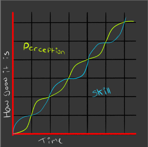
I really believe in this chart. It shows that your perception of what’s good and your physical drawing skill almost step up in complete opposite bursts from each other. This is why you will start to see your drawings “get worse” when in reality, your skill just isn’t increasing at that current time - however, your perception is.
You need to understand that you cannot become an Art God (tm) right away. You also can’t have your skills incubate without doing anything and think “oh i’ll be good in a couple years so i wont try” no bitch thats not how the game works.
Constant practice is what drives constant improvement. You may not be absolutely great now, but you are still allowed to enjoy it! You’ll get there eventually, why not have a little fun along the way?
I might not like my art teacher all that much but today she actually said something that I took to heart. Today she explained what we have to complete for our course and she talked about how you may not like some of the things that you do, but keep those in a folder. The examiners will look at them, but only save your best work for your exhibition. Your folder shows your journey. It’s a necessary journey, but there is still work that you’ll produce that will be your best. That’s the work you can show off and be proud of, but still appreciate the not-so-good work because you’ve learned something from it. You tried something, you learned how to do and not to do something. You can use that art to improve your further endeavours. It’s all about the journey. Art is a journey.
Let me put this into an online art world perspective for you:
Say you have a portfolio on the internet that you only upload your best art to so you can show it off to your friends and other artists because you’re proud of it. And say that you also save all your art into one folder on your computer. Not all of it is good in there. some shit with wonky proportions. the head was too big, that lineart was crap, their hands look like they were mangled by a fucking combine harvester and then reattached, etc.
Your portfolio is your best work. You’re proud of it. Cool.
Your art folder is full of unfinished sketches that you went back to and thought “ew thats awful” and so you vowed never to do that again. See? you learned something. You learned not to make the head that big. You learned that the way you drew that hand was not in sync with the rest of the drawing.
YOU LEARNED SOMETHING AND THAT’S JUST AS IMPORTANT AS CREATING SOMETHING YOU’RE PROUD OF. WHY? BECAUSE YOU CAN TAKE THE NOTES THAT YOU MAKE FROM YOUR OWN SHORTCOMINGS IN YOUR WORK AND YOU CAN IMPROVE NEXT TIME. TURN YOUR TRASH INTO TREASURE.
To finish: some quickfire tips that I’ve learned.
Find communities where you can share your art and get feedback. Discord servers, Deviantart groups, etc
Make art friends! Holy shit bro if you dont do that then who are you going to
ASK FOR HELP WHEN YOU NEED IT YOU AREN’T BEING RUDE FOR FUCK’S SAKE NOT EVERYONE ON THE INTERNET IS EVIL THEY’LL BE HAPPY TO HELP IF YOU’RE NICE AND POLITE!!
Send artists you like asks and questions in DMs (if they have them open to non-mutuals)! If you are ignored, just fire them an ask on anon or another quick message cause they might either be a) busy or b) they didn’t see the notification for the messages
Participate in collabs and fandom projects or even make your own! like holy queen elizabeth II on a wheel after starting The Beach City Witch Project (a Steven Universe fan episode animatic) in 2017, I got the chance to meet and work with artists whom i’d been looking up to for LITERALLY YEARS. They are really super nice and chill people and I actively ask for a quick redlining of a pose or a question about commission etiquette or something and it really helps me. I now have a discord full of over 100 people who create music, art, literature, etc. Not everyone in the server is active all the time, but we have a core active user-base of about 30 people. We have a chat for art references, a chat for sharing links to cool art we’ve found (the #1 rule is that you credit or link directly to the artist/art) and we have a chat for posting and critiquing art that you’ve made. It’s a really good system and one that I recommend to anyone with an art-focussed server.
I hope that there is at least something in this block of text that someone has needed to hear. Please reblog this so I can spread my kinda shitty wisdom because i know how y’all feel. I felt that way once. I feel that way now and I will again in the future. You aren’t alone.
#artists on tumblr#txt#long ass post#this was longer than i expected i spent like an hour on this#i have no time to finish what i was drawing lmaooo
16 notes
·
View notes
Text
Morose Mononokean II 4 - 7 | Mob Psycho 100 II 4 - 7 | My Roommate is a Cat 4 - 6 | Double Decker! EX 1 | Egao no Daika 5 - 7 | Shield Hero 4 - 6 | Magical Girl Spec Ops Asuka 4 - 6 | Royal Tutor movie
Morose Mononokean II 4
Aw, another little fuzzball to steal away my heart? I’m being spoiled, aren’t I?
For some reason, this episode was meant to be really emotional, but I felt pretty restless while watching it. Probably because I was thinking about playing Merc Storia all that time.
Mob Psycho 100 II 4
Didn’t expect Shinra to be back after his previous appearance…
Notably, you’d expect Matsuo’s name to have the kanji for “pine tree” in it, but it doesn’t - it has the kanji for “demon” and then one more.
I loved it when FLCL and SGRS went into manga mode, but for some reason, the transition into manga mode didn’t land as well here…hmm.
“I’ll go inside her…With an out-of-body experience.” - That sounds majorly wronggggggggggg, Mob, y’know? Even with context.
I find it interesting Mob perceives himself to be naked…as in, unguarded. He’s fine as he is and doesn’t need to change…in some ways, anyway. He could probably do with a few more emotions, but you get what I mean.
Wha-wha-wha-whoaaaaaaaaa. You mean, Mogami just got rid of Mob’s powers??? That is a nasty cliffhanger!
My Roommate is a Cat 4
Just seeing Hiroto near Kawase’s armpit…so unfazed…it’s kinda funny, but only mildly.
Tuxedo cat…ergh. The differences between American and British English never ceases to trip me up…I mean, the term makes sense…it’s just the differences between the types of English I’m annoyed at.
If you observe the OP, you’ll see Haru has that collar…I’m not sure if that’s meant to be a spoiler then…
Haru basically has the mindset of Kaguya and Shirogane, which makes this hilarious (and yet it’s still justified due to being a believable mindset for a stray!).
S-Smug dog!!!!!!!!!!!!!! Get out of the way of Haru-chan!
Shield Hero 4
“Draw your swords!” – Wasn’t there a rule saying Naofumi can’t use a sword anyway? Plus, Motoyasu has a spear, not a sword…
Balloon? Now, that’s funny!
Using magic to intervene is the cowardly action, methinks, Myne.
I find it interesting Naofumi sees Raphtalia as a little girl – it’s a perception of vulnerability, potentially weakness – when things are shown through his perspective.
Falling Through Starlight is beautiful, y’know that? Be-a-uuuuuuuuuuu-t-i-ful!
Magical Girl Spec Ops Asuka 4
Interestingly, Francine kinda looks like Mami (Madoka Magica).
Wait, is this woman Miura? (Sorry, I’m just wondering why Abigail – the blonde evil magical girl – would choose to use yakiniku to threaten people…)
Oh dear…it’s that train question (save one or save many).
Neding authority before you can actually do anything legal…now that sounds like Double Decker.
“Chef”? I was mortified when it came to the rusalka scene…but I think we already know why Povar is a chef…
CQC? Close quarters combat? Ooh, I’ve never heard it abbreviated before.
Well, I like how Povar and Rusalka Man (can’t spell Russian to save my life) always keep their salaries in mind. Makes them easier to see as evil.
Egao no Daika 5
Oh, this series has two moons? Kind of like Double Decker’s two suns, yeah?
I just realised Lily’s the only one with a skirt on her suit…
Morose Mononokean II 5
I don’t think I’ve seen a Fuzzy-centric episode ever since the first time we met the furball…
That hand on neck thing is apparently a CIA technique if I interpreted it right…just, it’s applied to a purple/white lion, so it’s hard to tell whether it’s the real thing…
Fluffy tadpole is best tadpole. All fluffy things are cute to me, even the lethal ones…I guess.
Seriously, if someone doesn’t call the animation of the Executive sakuga, I don’t know sakuga! That crow is some fancy animation!
Hanae’s mother is scarier than most youkai, given she can give me a nasty jump scare!
Mob Psycho II 5
This episode’s called Discord…which maks me think of the chat program of the same name…weird, huh?
Notably, it’s Dimple’s voice coming from Mob’s mouth…hmm.
That episode was real cool…it’s too bad by turning off the volume at the wrong time, I missed the Sajou no Hana song…
My Roommate is a Cat 5
Roku, Nana, Hachi…haha.
I noticed Haru has smaller eyes than Hachi…aside from the collar of course.
Aw…reunion too cute. I honestly think that this show has a fairly effective use of “filling in the gaps”, as it were, and thus making good use of cuts.
Double Decker! EX 1
Yep, we’re back with Double Decker!!! I’m glad to see it back, really.
Wait…ohhhhhhhhh. So Double Decker! doesn’t just refer to the bus in this show or the system. It means “2 Detectives” in Japanese (in a codeswitching sort of way). It was wordplay all along! Ohhhhhhhhhhhhh! I get it now!
This Deana assassin stuff must be a lie…
(after the commercial break) C’mon, Kirill, buddy. You’re drunk, y’know that, right…? Right??? Update: Oh, not drunk, dreaming. My mistake.
Oh, I was just saying that My Roommate is a Cat dos a nice job “filling in gaps”. Didn’t realise Double Decker did it as well. Also, how the heck is Doug unpopular with women???
So…Kirill actually got hired based on his feminine looks? Geesh, that Travis…
The thing I missed about this show was not being able to play the ED after an episode, so I’m glad to have it back!
Spec Ops Asuka 5
Having Kurumi fix up Nozomi’s arm kind of erases the consequences…but that’s what Kurumi’s for, right?
Barber Scissors…? Is this what happens when you take Kill la Kill way too seriously?
Wowee. Din’t think Sacchuu was capable of dealing nasty punches as well.
There’s gotta be some sort of parallel between Abigail and the queen vs Asuka and Kurumi…
Post-credits segment. Keep watching.
Shield Hero 5
Headbutt to the nuts! Oof!
When it comes to races, the one tune that comes to mind is one from the Dog Island (track 22 from this YouTube playlist).
I swear there was CGI during the race…on Filo.
Please don’t make jokes about Naofumi liking lolis, people. This is not that type of show…
Mononokean 6
Is it just me, or has this epiode been relying on the use of blue speech bubbles for humour more than normal?
It’s Mononokean: Sports Anime edition!
For some reason, I find the name “trashboat” hilarious. It was probably just “ponkotsu” (piece of trash) in practice, but the variation in English is really something to behold…
Ashiya sleeps like an old man, LOL. It must be cosy in that bed…
Moja is just adorable in whatever scene it appears in! Even Moja being dragged down a stream is cute~!
Relaxing your shoulders, huh? That reminds me that that’s a destress technique I haven’t used in a while. My head’s been spinning while I was trying to watch this episode, so I should probably get back to trying to do that stuff…after this episode, of course.
Price of Smiles 6
You think Spec Ops Asuka looks bad? Look at Price of Smiles melt in this “Yuni! You should recover!” scene.
For some reason, this one dude (I forget his name) being a father surprises me. He looks like the type to be single…
The female version of the name “Noel” is Noelle…get that right, people!
Layla’s right when she says one of the main causes of war is the struggle for resources and wealth.
Mob Psycho II 6
I noticed instead of a Mac or something, the computer is a “One” computer.
The board says something a lot more complicated than Saitama’s routine…which means One likes exercise. Maybe…probably.
“Codomo” phone, LOL.
The last time I heard of tofu in anime that I remember…was Boueibu. Something about Ryuu killing a man with tofu.
Somehow it didn’t occur to me until the eyecatch was over but the block…was tofu!
How do you even get drunk when there’s no alcohol in the drink??? (LOL)
Oh! Shinra again!
…Also Jodo Kirin!
Shield Hero 6
Naofumi is giving 0 f**ks about the dressmaker’s love of Filo.
Why is Filo CGI…? It looks unnerving, to be honest with you.
My Roommate is a Cat 6
Eleventh grade…16? 17? Heck, Yugo looks 27, not 17!
Notably, “Comic Polaris” is the name of the magazine that publishes the manga of this. Hence “Novels Polaris”.
Heck, Subaru. In the internet age in particular, people write to affect others. I should know, as someone who did just that just a few years ago!
Oushitsu Kyoushi Heine movie
Yay, we’re back! Crunchyroll bringing over movies is definitely increasing my workload for these commentaries, so with all the new things I’ve added to my lists of priorities as of late, I wonder if I can keep up…
Hitting us with CGI in the first minute of the movie…oh man, how far does CGI go these days???
Honestly, in my brain Wagner (Classicaloid) = the twins (this movie) = the Beppus (Boueibu LOVE! LOVE!). They’re very similar in terms of personality…
In the same way, Bruno = Schubert from Classicaloid (but swap one’s Sensei for the other’s Senpai).
Licht = Motz.
It seems like someone liked ponytail!Licht enough to keep him here. So it really wasn’t just me, huh?
Seriously, what’s this “God of War” stuff anyway???
Man, vocal exercises? This takes me back to my piano-playing days…I was a sightreader and only had to do one of the two (out of sightreading and vocal stuff), but there was someone else who had to do both.
This piano is bugging me. Its white keys are black and its black keys are white!
Somehow, Heine’s small top hat suits him. It’s probably because he wears a small beret in that same position usually.
More CGI background characters…*sigh*
Hmm…soft power at its finest(?)
Seriously though, why did that evil Duke guy appear in this movie again??? He has zero use plotwise. Sure, he was important in the first season and if we ever get a second he’ll be important there, but here? Nada!
Have you noticed Heine is in all those dance positions a girl would normally be in??? Hmm! Interesting! But still…if there’s one thing I ever missed from the anime’s experience, it would be-oh, scratch that! This is my cue to watch the cheesy live-action dance ending! I missed it so much!
Egao no Daika 7
Seriously…who is Eins talking to??? Whose emperor???
They still haven’t revealed what this new guy’s name is, even after his introduction…well, technically he was introduced at the River Deese, but we still didn’t learn his name then. (Did we?)
Spec Ops Asuka 6
Is Mia just this show’s version of Kyouko (from Madoka Magica, but American of course)???
Oooooookay, that (with the kissing and stuff) is so not what foreigners are like, people…
Oh, goodness. Have I really been living with this stuff (girl x girl teasing, with Kurumi in particular being one of the more extreme examples I’ve seen) in my magical girl anime for years now? I mean, Suite PreCure is laced with the stuff…
If ordinary rigor mortis business is at work, then I’d say the heater is to speed up the rotting of the corpse…
LOL, there’s Halloween-class…and then there’s Voorhees-class…how appropriate for Disas.
“Only one of the Magical Five would’ve known about that phrase.” – My bets are on Peipei, but we’ll find out for sure…someday.
Mononokean 7
As much as I found the pillow fight scene with Fuzzy in it funny, I swear Abeno is a bit too sadistic for my own good. What is it with some women and their sadistic kinks…?
Abeno calling Ashiya “hunk of junk” makes me think Ashiya isn’t much of a Sousuke (from Classicaloid), but they do have a lot of similar character traits, now that I think of it…hmm.
For some reason, I think Abeno knew the conditions of the deal and what the deal entailed in advance, hence the training camp.
Seiza…means sitting on the floor in the position Ashiya was in (knees to the floor etc).
Mob Psycho II 7
“Cheeseburger Tornado”, LOL.
When Reigen got angry at the TV, I was just like, “It’s Shield Hero (Mob Psycho version)!” I.e. you con the conman and not turn the conned into a conman…or something like that.
Those microphones are so obviously CGI, people…
I know I’m a fan of Yuzuru Tachikawa, but episode 5 actually didn’t do too much for me, to be honest (even though it was visual spectacle, which is Tachikawa’s strong suit). However, while episode 7 looked less punchy overall, it was miles better…
“First-press limited edition? That is the absolute best decision.” – What is that referring to??? Update: It’s referring to the BDs...or DVDs...or both.
Update: Forgot to add Double Decker to the title and tags.
#simulcast commentary#mob psycho 100#Mob Psycho 100 II#the rising of the shield hero#tate no yuusha no nariagari#Magical Girl Spec Ops Asuka#Mahou Shoujo Tokushusen Asuka#my roommate is a cat#doukyonin wa hiza tokidoki atama no ue#oushitsu kyoushi haine#the royal tutor#egao no daika#the price of smiles#Chesarka watches Oushitsu Kyoushi Heine#Chesarka watches MP100#Chesarka watches MGSOA#Chesarka watches Tate no Yuusha no Nariagari#Chesarka watches Doukyonin wa Hiza Tokidoki Atama no Ue.#Chesarka watches Egao no Daika#fukigen na mononokean#the morose mononokean#double decker#Double Decker! Doug and Kirill#Chesarka watches Double Decker!
3 notes
·
View notes
Note
Duuuuude, you're wanting to talk about character design stuff? Can you give me a basic rundown on... Well, pretty much everyone? I love hearing about this stuff!
Of course I can! I don’t really do basic too well, so look under the cut X’D

To me Dolly’s changed a lot over the years. Her colors started off as the left thumbnail, with more of a sunburnt looking mouth and far redder brown coat, and in the first update she also had this kinda mullet mane look to her? Not to mention she rocked the big “Sombra Snoot TM” at the time with nubby sticks for legs and the brown under the green (I was trying to do that weird hazel eye thing lol). But, the overall look to her hasn’t strayed much from the first drawing I did of her. I really wanted Dolly to have a simple but appealing look, one with softer features and big eyes that would draw people in. She’s still just a little thing so as my proportions got better later on I realized she needed thicker legs, a little pudgier around the overall features, and so on and so forth.
I think the main challenge at the time was figuring out how I wanted little donkeys to look. We’ve only ever seen Cranky and Matilda in the show, and at this rate its safe to say they just won’t make more donkeys later on. I never had much to go off of beyond the old flashback they showed right here:

But, notice something. Smooth legs, pudgier body, a liiiitle more exaggerated around the snoots overall. And, the important string tail. I liked these features, but I remember trying this exact thing on Dolly and thinking it just looked odd? To me, kids tend to have nubby knees, big ears that they have to grow into later on, softer features in general! So I just rolled with that, and later when I added the little heart look to her ears… Honestly I just wanted to break away from the above, cause they kind of remind me of chihuahua ears whenever I tried to draw them lol. Plus, Dolly needed something a little more for me to sell the younger appearance, and I feel the little heart look in the ears helped a lot! But overall her palette has been tweeked slightly, her snoot got smaller like Matilda’s but became more centered on her face, and my crowning achievement personally:

I looked for a manestyle I sincerely loved and tweeked it from there. In the first reference of Dolly I openly said to draw what I lovingly call “The Scootaloo Swish,” which is a bit messy but with a little flare. Dolly, as a young donkey, needed something fun but short, and I remember struggling for months before the blog was even opened, trying to fix the hair into something I liked, until one day I took a break to draw ponies instead, and I realized I drew Scootaloo with too big of ears. I added more poof, gave it a more uniform look later on, and that’s just how I’ve rolled ever since! And I always draw the tail the same as I do the mane, it makes things easier and more uniform. Oh, and the bow… Well that’s for later, but at the time I thought I made her too boyish so I put a bow on her in hopes that people wouldn’t confuse her for a little boy X’D

LOOSEY BALL CHANGED A LOT TO ME FROM HER FIRST CONCEPTS LOL
Her first name was Nip, she was going to be more like this exotic servant in the area that Dolly was going to meet, and just, more like… Rarity, in a sense? She wasn’t originally designed in the sense of making a new species either- she was a regular diamond dog with still kind of a ball tail, but more like a tiny club, like in the show. Later on I decided to go with a more square jaw, a thicker neck to support her head, and the tail was fully influenced by the ankylosaurus since I wanted a stronger appearance. Later on these two features turned to two breeds of hounds, and I’ve just done my best to balance them as I’ve grown as an artist~.
Oh, and Loosey was originally going to have black markings over orange. And her blue text is a reference to the original collar and eye shadow she used to have lol.

I struggled with Diamond for a looooooong time, she was first designed with the intention of being Dolly’s best friend and fashionista extraordinaire. My main issue was always her colors, the first pass being called a Rarity rip off, she was blue with a yellow mane at one point- it was all a mess X’D
But her personality felt so forced. She was cute and bubbly at first, but the more I drew her the more I wanted her to become a tougher little filly. Don’t get me wrong: she still adores jewelry and frilly things and curses the fact she just has never had it. But back then she was a noble’s daughter who just kinda snuck into Dolly’s yard one day, with dreams of being a high end jewelry designer and using Dolly as her top model someday. It’s still a really cute concept, she just ended up growing in a far more interesting way! Hope to show you guys that side of her soon~.

Out of everyone Clippity Clop is the only one who has stayed the same since she was created, but that’s because I had a dream about her. Originally the group was gonna have two boys and Diamond Riviera, neither of which were Autumn Wind, and I was struggling with names and shoehorning them in. They were okay, but the two of them overall made the story more complicated for me, and I couldn’t connect with them right. Then one night I have a dream about Dolly instead meeting Diamond and this little filly, Dolly being shocked by her upbeat personality and the filly immediately trying to cheer her up through a little song and dance. My one regret is not making her coat a softer pink, but considering she’s been in the mines all her life the muddier quality feels better to me with the more matted look.

I really wish I was able to save all of Autumn’s old concepts, they were unfortunately lost when my last computer broke and any old pencil sketches I have are off in old sketchbooks.. But in a way, Autumn was developed from five different concepts of colts. The two original colts, Joey and Quack, one after they were scrapped was simply called Ram (he had a ram for a cutiemark and was gonna be a really good climber), after him was Winter Gust, and later Chill Gust… But, interestingly enough, he always had natural colors. I wanted the girls to be brighter, more vibrant, whereas he would be more of the anchoring point with more pleasing natural colors, all the forms having some sort of brown as the main base heehee. He did have a smaller snoot back then like how Pipsqueak or Featherweight kind of have in the show, but this specific concept was the only one with a bigger muzzle. I was worried that the look would make him look way too old, but there was something about it that just stood out better than all the others, and on top of everything it was the easiest to draw! And once I had his markings and coat color down I already knew the manestyle, so I went with more of a poofy crinkly look. And I remember staring at him and wondering what color to make it. And that conversation with myself ended up being like “He’s brown… Not dirt brown, that’s a pretty tree brown… I like Autumn, orange trees are pretty oH MY GOD–”
And, as for Sealed and Cana… They really haven’t changed? Cana’s hair got better, that’s for sure, but Sealed was the one who started it all. I designed him first, then Cana, and finally Dolly because I wanted them to have a unique daughter! The most he changed was height wise, when I made him Troubleshoes size! And, that’s about it for character design talk! Sorry that got lengthy, but I really am proud of how much they’ve all progressed, and I hope to make even better designs later on! ;w;
#Scribbly's Scribbles#Dolly#Loosey Ball#Diamond Riviera#Clippity Clop#Autumn Wind#empressofthelibrary#character design question#THAT WAS A DOOZY WOO#mlp
9 notes
·
View notes
Text
Landscaping Design Software For Mac Free Download

At my college, I teach a course named “Computers in Landscape Design” where I train landscape design students in AutoCad and Adobe Suite Programs, among others. These programs are tremendous for landscape designers who wish to use industry-standard software like regular landscape architects; however, they can be very expensive.
3d Landscape Design Software Free
Best Free Landscape Software Downloads
Students often do have access to free trials of the software, but for anyone interested in continually using them for the purposes of their professional business, eventually they will need to pay for the programs. To provide some perspective, currently the subscription for AutoCad software is around $200 per month. Unfortunately, this is just too expensive for many new business owners.
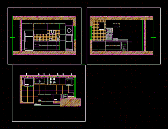
The most advanced landscape design software, for the most incredible landscape designs. VizTerra offers a streamlined interface, intuitive tools, and an extensive 3D library that makes it seamless to draw in 2D, transform your ideas into 3D, and then create a fully interactive 3D presentation to share with your clients — instantly. Home Designer Landscaping Software by Chief Architect (Paid) Chief Architect is one of the leading developers and publishers of 3D Architectural home design, and have also developed a software for landscape design that is just as up to par. This is often used by architects, interior designers, landscape designer and home designers, even DIYers. A free version of DreamPlan home design software is available for non-commercial use. If you will be using DreamPlan at home you can download the free version here. See more house design software screenshots.
Students often ask me if there are any free landscape design apps that work well for professionals. Over the past several years, I tested many free landscape design apps on various projects. In this article, I will review the pros and cons of the market’s five main free landscape design applications.
First, I won’t keep you guessing – my recommendation for the best free app is iScapes. The iScapes app is by far the best free landscape design app among its peers, having quality graphics, a solid user-interface, and a good plant library. In the table below, I provided a breakdown of some of my ratings for each of the five design apps. In case the image is too small, click here to download the pdf version. I will provide some helpful insights of each app in the sections that follow, along with some common issues that may influence your decision before downloading. But before you head off and just download the iScapes or PROLandscape app, I want to give you a little piece of wisdom I’ve accrued over my years of design. There is no substitute for a poor knowledge of landscape plants or design. If you are new to gardening or landscape design, before you purchase any app, I would highly suggest picking up a copy of The Essential Garden Design Workbook along with some essential drafting supplies and learn the old-fashioned way. Not only will it be fun, but you will be a better designer by doing this.
Okay, that’s my word of warning – now onto the reviews
Finally – before I diveinto each application – I must state that noneof these free programs compare to the professional industry standards ofAutoCad, Vectorworks, PROLandscape, or Dynascape. Although these programs dohave some good features – they just simply cannot match the quality of theprofessional software. But for those designers that are looking for a cheapoption that can get the job done, some are worth checking out.
iScapes (Rating: 16/20 )
The iScapes software offers a free and paid premium subscription service. The paid service offers a larger plant library, along with additional image downloads, and project archives; however, the free version is very useful for a beginner landscaper or do-it-yourselfer. The biggest disadvantage of the app is that it is currently only available for iPhone or iPads. For Android users, they will need to find a substitute. To try iScapes, click here.
Pros: The biggest advantage of this app is the graphic quality of the three dimensional landscape elements. The drag and drop interface, along with the visual characteristics of the app make it very useful to professionals doing quick designs for clients on-site.
Cons: As with most of the apps you will see on the list, the major disadvantage is that if you want additional quality add-ons, you will need to pay. A more extensive plant library, along with additional project storage is available with payment.
Home Outside (Rating: 10/20)
I originally had high hopes for the Home Outside app, as the average app review was 3.8/5.0 with many positive comments. After having used the app in many different types of projects, I was disappointed in the lack of three-dimensional perspectives and the limited plant library. To test out the software, click here.
Pros: For plan graphics, the renderings are quite nice and the app allows for the importing of google maps of your customer’s property.
Cons: The biggest downside to the app is the lack of any real plant library. The plants are categorized by “tree” or “shrubs” with no indication or availability to specify the planting in the free version. The paid version does offer some extra features.
Home Design 3D (Rating: 5/20)
Home Design 3D was an intriguing app that had very distinctive reviews when I originally had downloaded it. People seemed to either love it, or hate it. Unfortunately, I was one of the latter. The app is very useful for interior planning and design, but falls short for any realistic landscape design applications. To try the app, click here.
Pros: The only thing the app has working for it is the 3D aspect. The three-dimensional rendering capabilities are better than I would have expected for a free app.
Cons: The user-interface is very poor and the app itself is not intuitive. This combination makes for a very difficult experience for a designer, especially when there are other options available. I would hope that future updates provide pop-ups or a tutorial at the beginning to help designers navigate the platform prior to starting a design.
PROLandscape Home (Rating: 5/20)
I will start off with a disclaimer. In one of my classes, I train designers on the PROLandscape Professional Softwares (Planner, ImageEditor, and Proposal). These are good (but expensive) programs that are very useful for design. I believe it is a great marketing strategy by the developer Drafix to provide this free app to showcase some of the basic features of their paid programs.
With that being said, I found it difficult to provide an honest review of the free version because I kept remembering the full functionality of the paid programs. In any case, I did my best to realistically provide good feedback on the user-interface. Overall, there are many elements that can be improved. To test this out app, click here.
Pros: The free software has many similarities with the overlay perspectives of Home Outside, but with a greater plant library. The biggest drawback of the software is that most of the plant database is only offered for the paid version.
Cons: The app is not very intuitive and there is very little within the program to provide help or support. Also, there is a limited availability of plants, with poor customization, and relatively no ability to modify the existing library.
Sketchup Viewer (Rating: 5/20)
I had originally downloaded the Sketchup Viewer because I had received a recommendation about the app from another designer. I already have extensive knowledge in Sketchup, along with a variety of other 3D Software programs including three-dimensional CAD, Rhino, and Revitt, so I figured the Sketchup Viewer was worth a try. In general, it was a big disappointment as the viewer does not really offer anything valuable for a designer that does not have access to the base-program of Sketchup. To test out the viewer, click here.
Pros: If you have the ability to work on a regular computer to complete a great 3D model in Sketchup, the Viewer is useful -essentially just a tool to view the model and show it to your client on site. Other than that, the viewer does little else.
3d Landscape Design Software Free
Cons: It is not a design software and offers no specific landscape capabilities. The app is obsolete without actually using Sketchup to generate the landscape model.
Final Thoughts
If you are looking for the best free landscape design apps that also offer some assistance in designing and showcasing designs to clients in a professional manner, then I would recommend iScapes. If you do not have an iPhone or iPad, use Home Outside.
None of the free apps have great functionality when compared to their paid counterparts. If you are starting out in the design profession, the free apps might be worth exploring but you will quickly find better value from some of the other paid alternatives.
If you haven’t already – check out my article on Gift Ideas for Landscape Designers – you can use the money you’ve saved on some nice things for a fellow gardener, or yourself.
Best Free Landscape Software Downloads
For more articles on Landscape Design, please be sure to check out our Design resources and landscape Business articles.
____________________________________
ImportantLegal Disclaimer: This site is owned and operated byDraftscapes. We are a participant in affiliate marketing programs designed toprovide a means for sites to earn advertising fees by linking to participantvendors. Affiliations include Utrecht Art Supply and Amazon Associates.Draftscapes is compensated for referring traffic and business to thesecompanies. Recommendations for products or services on this site are not influencedthrough the affiliation.

0 notes
Text
The Making of Wonder Woman
Okay so we’re gonna take a quick break from medical content so I can talk to y’all about what I’ve been busy with for the past few weeks outside of applying to residency.
My halloween costume.
I’ve known since last halloween that I would be Wonder Woman this halloween. And then the movie came out and everyone told me I looked like her again and so the deal was sealed. Unfortunately, all of the store bought Wonder Woman costumes are.... pretty inaccurate looking. When I do Halloween, I do it big. And when it comes to my favorite super hero... well, let’s just say I wasn’t going to settle for something crammed into a bag. After scanning the internet, it was clear that I couldn’t shell $500-$1000 dollars on a professionally made WW costume... so to save some money and get the costume I wanted, I decided to do it myself. Here was the result:

NOT BAD, RIGHT?? I had never done anything like this before, so I’m pretty proud of myself. (also sorry the picture quality is meh. I’m getting the iPhone X this week and then DEFINITELY re-take pics. Honestly, I might do a photoshoot. I don’t know)
People have been asking like crazy, so I’m going to breakdown how I made the costume a little bit here to cover the basics. For the most part, all of this can be found on youtube, but I’m going to post my pics here just to take y’all through my process.
First: Making the mold. You’re gonna need help. Wrap yourself in Saran Wrap and get someone to put duct tape all over you to get a pattern the shape of your body. I had my brother help.

Draw markings where you want to cut the tape off and to help you line up the edges, then take those pieces, make notches in them so they will lay flat, and trace the patterns onto EVA floor mat foam. Then, cut out the foam, heat it with a heat gun and hold it against your body to make it curve correctly, then use liquid cement to glue everything together.

So once that was done, it was time to make the pattern on the armor like Wonder Woman’s armor. For this, I used a soldering tool that’s shaped like a pen. First I freehanded the pattern from her armor onto the foam with a pen. There has to be a better way to do this, but I don’t know what it is. When I started, it was kinda rough because I didn’t let it heat up all the way before I started carving and that made my lines kinda scraggly at the start. Luckily, I got the hang of it.


Now for the REALLY hard part... making the gold top of the armor. Holy cow. This part took me a day and a half. So I drew it on heavy poster board paper and cut it out, taped it to the armor, redid it again... and again... and again...


Once the paper was perfect, I cut the foam out and again glued it all together and taped it to the rest of the armor to make sure it looked right.

This was on the Tuesday before Halloweekend. I only had about 4 days to finish the whole rest of the costume... At this point I pretty much had all the supplies I needed, I just needed to really start putting everything together.
Next came the belt. Which sits flush with the bottom of the armor. To accomplish this, I took thin paper and drew the shape of the belt I needed on top and then transferred that onto the foam. I cut the belt out of the EVA foam I used for the armor and dremeled down the back of the belt and the bottom of the armor in the shape of the belt so that they fit together. Then... it was painting time.
First I covered all the foam in black plastidip, which is a rubber spray coating. It seals the foam for painting.
The gold metallic spray paint was very easy to find. Any Walmart is gonna have it. The red metallic spray paint.... not as easy. Hobby Lobby, Walmart, Michaels... they all failed me. What didn’t fail me? O’Reilly Auto Parts. Grabbed a can of metallic car paint and HOLY COW. Man that stuff works wonders. I only needed one small can, which was good since it was the only can they had in stock. It’s great stuff.

I’ll be honest... I had to be convinced to weather my costume. I wanted it to look all brand new and shiny and like Diana had just stepped off the island... I’m glad my friend told me to not do that. I cut notches into the armor with a razor blade and held my heat gun over it, causing the foam to open up. Then I went over it with black paint and wiped it away so it stayed mostly in the cut. And get this- that little pink tube? Old mascara. The brush gave me the perfect worn metal texture I needed. On the bodice of the armor I also filled in the grooves with black paint to give them more dimension, and I did a little shading work, which I didn’t photograph. I’m sorry. But here’s what the bodice looked like after I finished painting.

HUGE difference, right? I actually went and weathered the top even more after this picture was taken. I attached the belt with velcro (honestly, don’t do this. Just use super glue. Use all the super glue) and the top with liquid cement.
So what was left at this point? Skirt, gauntlets, arm band, lasso? For the record, I bought the boots and the tiara. I’ll link them at the bottom.
For the skirt, I bought some kids XL volleyball shorts from Academy, brown leather from Hobby Lobby that was some kind of furniture fabric, a gold paint pen, and blue spray paint. I bought high gloss. I should have bought matte. Hindsight. I had to wait to do the skirt until the belt was done, because that’s how I based my measurement of how wide the front flaps needed to be. The middle one is just wider than the bottom of the W. I patterned the pieces looking at a reference picture of Wonder Woman, and I tried to staple them onto the shorts, which did not work because staples are not stretchy and the shorts are. I ended up whip stitching some pieces and glueing others literally while the shorts were on my body. I wish I had pictures of this process, but I’ll post the youtube video I used for guidance down at the bottom. Anyway, then spray paint, then gold paint pen to do the gold details on the bottom of the skirt.
Ugh. Gauntlets. So hard. Went back to the 3mm craft foam. wrapped it around my wrists to get the size they needed to be. Again, while looking at reference pics, I drew them by hand.

I should have plastidipped these, but then I’d lose my markings. I ended up just painting straight onto the foam. Probably should have mod podged them first, but whatever. Gold and black paint pens are your best friend for this.

Arm band. I looked up a reference image, enlarged it on my computer screen, turned up the brightness, and traced it onto paper and then transferred it to the foam. Sprayed the foam with metallic spray paint, then weathered pretty much as before. With black paint and mascara.

The gauntlets and arm band were held together with velcro. I just made them overlap at the back. I took the easy way out. I admit that. I used a shortcut. TAKE THAT ORTA PHONE INTERVIEW. YES I BELIEVE IN SHORTCUTS. Still turned out great.

For the lasso of truth, I just bought rope and spray painted it gold, and bought 2XL brown belts from Walmart and super glued them together to get the rope holster.
To get the armor on, I cut it down the back and laced it up with more gold rope. make sure you put the holes far enough apart that the foam won’t tear.
And then I just... put it all together! Skirt went on first, then a tube top under the armor, then the boots, then the armor (because you basically can’t bend over in the armor to put on the boots), then all the arm stuff and the tiara.
I’m blonde right now, so to get dark hair I used a black rinse from Sally’s beauty supply to darken my base, and then that black powder hair spray from Party City. Please do this BEFORE you do your makeup and maybe do it outside so the black powder doesn’t get all over your bathroom. and cover your shoulders and arms and face because it gets EVERYWHERE. Or buy a wig. Up to you. I also tried to contour my face to look more like Gal Gadot. Whether or not that was successful.... who knows?

(taken from a friend’s snap story)
So that’s that. That’s how I did the thing. Below are all the links I promised.
Breastplate: https://www.youtube.com/watch?v=rlmLchJcT7A
Skirt: https://www.youtube.com/watch?v=z2GFmSqg7V0&t=229s
Gauntlets: https://www.youtube.com/watch?v=c25sKA2LpLc
Click for Tiara Click for Boots Click for Plastidip Click for Red paint
#cosplay#wonder woman#halloweekend#wonder woman cosplay#Wonder Woman costume#DIY#WW#DC#Justice League#batman vs superman
53 notes
·
View notes
Text
Part 2 - Jikoshoukai (it’s looooooooong so please bear reading it at your own risk orz)
* I’m in my late twenties, but looks like a teenager; one time a jeepney driver mistaken me for a college student and gave me fare discount.
* Am a Taurus, I think iirc an A+? (have forgotten about it since high school, during our physical examination at the school clinic), and my birth date sounds like a Star Wars phrase pun.
* Height’s more or less a 5’5” (until that realization a month ago, I always go on believing that I’m a 5’3” lol).
* You can describe me as a (kinda) my-pace type of girl, but in my case, more like a girl who does things in a whim and more or less likely to regret doing them.
* Always bullied since childhood, that’s why I hold grudges until now haha
* First impressions (when I see one) are hit or miss. When a person did something that make me, say, cringe... 👎🏻 unless I can see some progress.
* Also cringed at wrong grammar and spelling (gdi so many apostrophe S’s I kennat—), no offense.
* Is a cat person nyaa~
* Always been drawing stuff since childhood, wherever I can set my pen/pencil/coloring materials/etc on....even on borrowed books at our university library. Shh~
* Speaking of books, since the age of two I frequently read and read and read lots of reading materials—ranging from novels to newspapers to magazines etc. Had a collection of them at home btw, paperbacks and US magazine backissues, mostly. Amongst them, had a few Jan Karon books (under the Mitford Years series) and some Lorna Landvik novels.
* Speaking of library, this is like second home to me... lots of books, computer stations, wifi (lol), air conditioning system (another lol), solo study cubicles to take a nap on whenever time calls for it, and you can borrow almost all of the books (max. 5-6 at a time).
* I’m one of the lucky few who are referred to as the Batang ‘90s (‘90s Kids)—because, unlike kids nowadays, we’ve experienced watching Tagalog-dubbed anime during weekday afternoons after school in the 1990’s and 2000’s-early 2010’s, for one.
* An anime enthusiast, always watching anime and reading manga, one of the reasons why I draw until this day—the other because of my dear aunt (may God always bless her soul~ Also am the Secretary of my college alma mater’s anime club for I guess two years idk? Ahaha~
* Cosplayed twice during college: the first one is a disaster and my second one is super goooood xD (One of my club senpais joked about the colors of the cloth used on our maid costumes—during my first year, we’ve managed a Maid Cafe during our annual University Days—being bright and vivid as the colors of the jeepney routes in our province; he called mine the Marisol, after the Marisol-Pampang route—ctto pic)
* Been fascinated with Japan and the Japanese culture since childhood: during Grade 2, I’ve purchased a Highlights Top Secret Japan puzzle set; during Grade 6, my older cousin who now based in Japan with her own family gave me CDs of Hamasaki Ayumi and EXILE, among others.
* Collected anime posters, laminated cards, and stickers during Grade 6 until all my high school years. Dunno where they are now...
* Am picky with what I watch and read, whether it’s anime, manga, or a novel/book/magazine. ‘Cause I have a damn refined taste lol
* I also have multiple fandoms across some of the genres. I’m an Hello! Project fan since 2008 (first oshimen was Morning Musume’s Kusumi Koharu, now it’s the 15th gen’s Kitagawa Rio from Morning Musume ‘20; also a BEYOOOOONDS fan—but I love all of the girls like my younger sisters....even though my real younger sister’s a pain in the arse sometimes), a casual 48G fan since AKB48’s Heavy Rotation hit the Oricon charts—and kinda supported its international sister groups too, like our very own MNL48...but kinda laylowed since late last year. Aside from MNL48, I also supported its similar (but related?) local aidoru counterparts, Aidoru Sozai and CH4U, since 2018. But, ever since that goddamn COVID-19 virus and quarantine started, the need to support the members had gradually lost in my hands (don’t worry tho, I still checked out on their SNS even if not on a daily basis).
* Before, I always listened mostly to idol songs (75% of which are H!P), but when my old phone broke (and we have wifi now) I tuned in daily to Spotify and listened to some of its playlists—to which I select a few songs and gathered them in my own playlist full of J-Tracks and old stuff.
* I’m a huge fan of Takaya Natsuki’s “Fruits Basket”, ever since I have watched the Tagalog-dubbed original/Studio Deen version on TV every Saturday morning during the early 2000’s. Read the almost-150+-ish chapters during my high school and college days, read some of “Fruits Basket ~another~”, and now currently watching the 2019 version. Also have a dog-eared TokyoPop copy of the ~Cat~ fanbook skl.
* Due to the influence of some of my artist collab buddies and a certain redraw challenge (#HaikyuuRedraw), at almost three? months, I’m basically new to the Haikyuu!! Fandom. In less than a month, I’ve watched Seasons 1 until the first half of On The Top!!—including the OVAs, read the full 400+ chapters of the “Haikyuu!!” manga non-stop (because, ‘it’s fast-paced’ as I have told one colleague before), and its spin-offs “Haikyuu-Bu” and “Let’s Haikyuu”, and watched all four compilation movies. (Now rewatching Season 2 btw...) *whispers low* Not to mention countless fanfictions and doujins...... FUN FACT: If you visited my Pinterest page, you’ll be annoyingly (imo) amazed at how many Haikyuu!!-related memes, comic panels, fanarts and stuff I have saved in my two boards. Also made some chibi fanarts (first one being Inarizaki’s Capt. Kita; will post Kenma’s later tonight) and some WIP sketches (one Hinata, one Oikawa—on an UFO, duh—and a Yachi... all of them chibified) that idk when the fuck will I start to work on them again qwq (Whew... my longest paragraph so far, sorry~)
* Created my Facebook art page and began sharing my doodles and drawings to the public since 2017 (more then three years ago), then since early 2018 started doing MNL48 and other local aidoru groups’ fanarts in trad (colored ballpens and colored pencils on cheap bond paper halves). Then early 2020, I started doing anime fanarts as part of a collab for I think half a year now.
* I have been a member of two artists’ collaboration groups on Facebook—MFA48 (specializing in mostly MNL48-related group fanart collabs) and Anime Art Collaboration Group (an exclusive-for-Filipino-artists’ collab group specializing in two-week anime collabs and other art activities, to which I’m a part of its Council as the Fukaichou/Council VP). Also a staff member at a memeposting Facebook page for more than a year now (belated Happy Anniversary to me lol~).
* Did make some padorus, a few memes—including an all-in-one virtual powerbank charger, ‘patent pending’—and stuff.
* WIPs old and new kept on piling up due to many distractions (namely, this phone I’m using rn and its many installed apps) and disturbances (my fam, on the top of the list). And I really hate it qwq hence the frustration and stress...
* A lazy person actually tee hee~ (and a big eater but kinda slim like Miaka from “Fushigi Yuugi”)
...well? Ahehehe~ hope you stick on reading all of these bullshit till the end, tho. Ja~ see y’all again! (^∇^)
(Hope it can fit within Tumblr’s character number parameters or something...)

#introductions#jikoshoukai#sorry the post’s too long#morning musume#hello project#beyooooonds#fruits basket#haikyuu#akb48 group#mnl48#aidoru sozai#loveso#ch4u#90s kid#drawing#anime#art#fanart#taking my time tagging here lol#doodleniella#tumblrniella#Spotify
0 notes